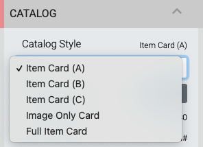
Item Catalog Style
One of the most commonly edited pieces of the Item Catalog will be its Item Card and the configuration used as this affects all of the Item Cards being displayed in the Item Catalog.
Item Catalog Styles are chosen from a drop-down selector of Item Card "templates".
Although the Item Cards generally perform similar functions, each having its own set of specific options, the card layout will use the options that are set specifically for that card. Setting an option in a different card will not have it applied across all cards.
Item Card (A)
Replaces the Small Item Card "Catalog style".
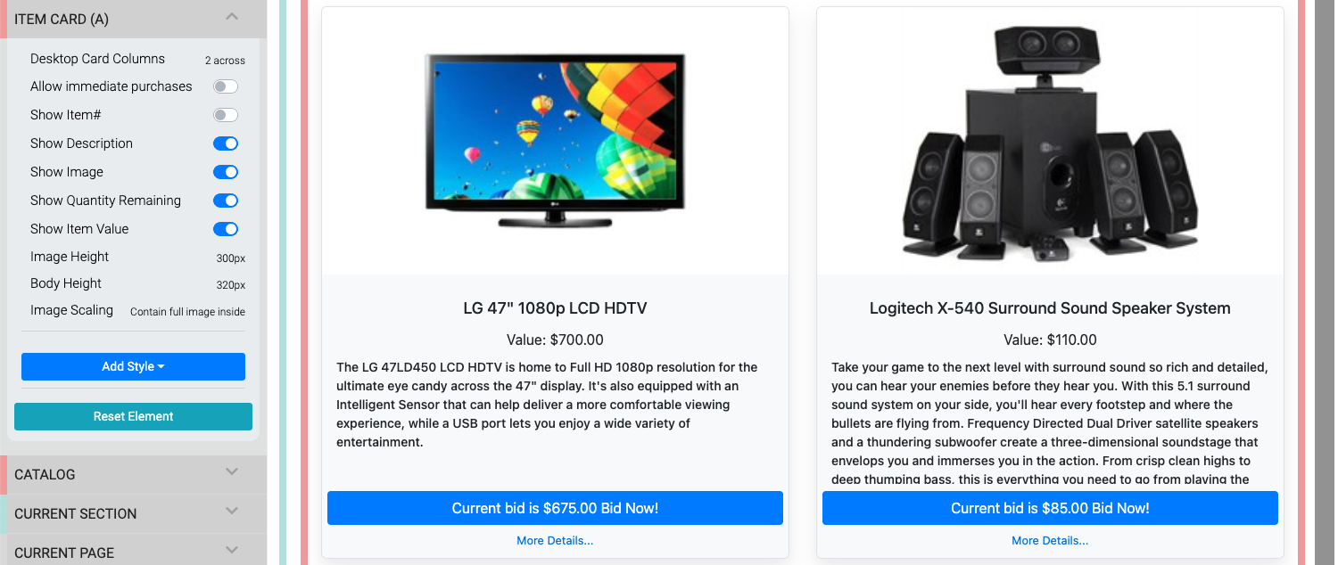
- Desktop Card Columns - a drop-down selector to set number of cards per row (mobile views are generally a single column only). Default:
2 across. - Allow immediate purchases - for use with For Sale Items only.
- Show Item# - displays item# on right side of item title.
- Show Description - toggles display of the description.
- Show Image - toggles display of image on card only.
- Show Quantity Remaining * - displays quantity available when value is set greater than
1. - Show Item Value - toggles display of item value.
- Image Height - sets a maximum height for the card image. Default:
300px. - Body Height - sets a height for the card. Default:
320px. - Image Scaling - crops the card to fill the image space or displays the entire image within the card image space.
Item Card (B)
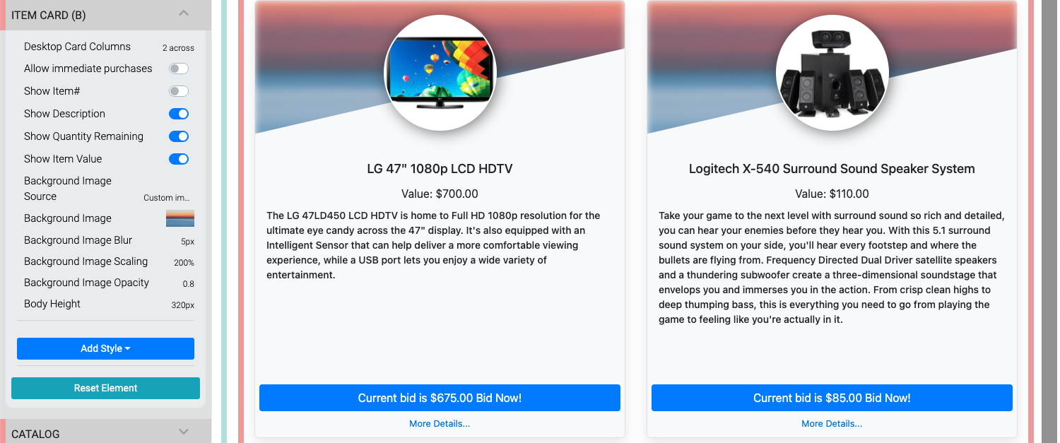
- Desktop Card Columns - a drop-down selector to set number of cards per row (mobile views are generally a single column only). Default:
2 across. - Allow immediate purchases - for use with For Sale Items only.
- Show Item# - displays item# on right side of item title.
- Show Description - toggles display of the description.
- Show Quantity Remaining * - displays quantity available when value is set greater than
1. - Show Item Value - toggles display of item value.
- Background Image Source - a drop-down selector to use the default Custom Image set for the card; or, the default Item image for the item itself. Default:
Custom image. - Background Image - this option only applies when Background Image Source is set to Custom Image. This will not have any effect when the source is the Item image.
- Background Image Blur - this is the value used to blur the background image. Default:
5px. - Background Image Scaling - this value affects the image size used in the card. Default:
200%. - Background Image Opacity - this value affects how transparent the image will be. Default:
0.8. - Body Height - sets a height for the card. Default:
320px.
Item Card (C)
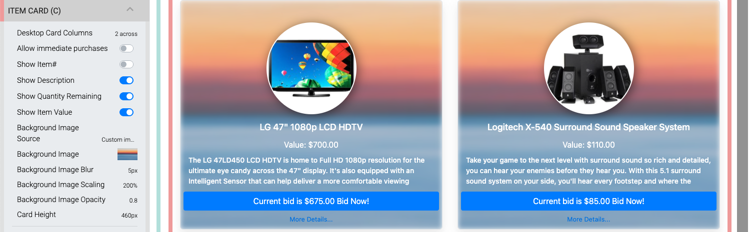
- Desktop Card Columns - a drop-down selector to set number of cards per row (mobile views are generally a single column only). Default:
2 across. - Allow immediate purchases - for use with For Sale Items only.
- Show Item# - displays item# on right side of item title.
- Show Description - toggles display of the description.
- Show Quantity Remaining * - displays quantity available when value is set greater than
1. - Show Item Value - toggles display of item value.
- Background Image Source - a drop-down selector to use the default Custom Image set for the card; or, the default Item image for the item itself. Default:
Custom image. - Background Image - this option only applies when Background Image Source is set to Custom Image. This will not have any effect when the source is the Item image.
- Background Image Blur - this is the value used to blur the background image. Default:
5px. - Background Image Scaling - this value affects the image size used in the card. Default:
200%. - Background Image Opacity - this value affects how transparent the image will be. Default:
0.8. - Card Height - sets a height for the card. Default:
460px.
Image Only Item Card
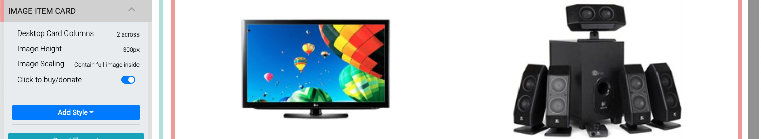
- Desktop Card Columns - a drop-down selector to set number of cards per row (mobile views are generally a single column only). Default:
2 across. - Image Height - sets a maximum height for the card image. Default:
300px. - Image Scaling - crops the card to fill the image space or displays the entire image within the card image space.
- Click to buy/donate - toggle to allow an immediate transaction for For Sale or Donation items only.
Full Item Card
Replaces the Wide Item Card "Catalog style".
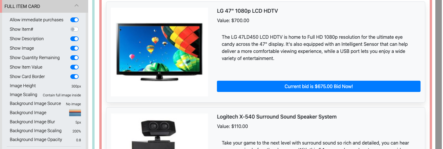
- Allow immediate purchases - for use with For Sale Items only.
- Show Item# - displays item# on right side of item title.
- Show Description - toggles display of the description.
- Show Image - toggles display of image on card only.
- Show Quantity Remaining * - displays quantity available when value is set greater than
1. - Show Item Value - toggles display of item value.
- Show Card Border - toggles the display of a border around the item card. This essentially provides a background the item card is displayed on.
- Image Height - sets a maximum height for the card image. Default:
300px. - Image Scaling - crops the card to fill the image space or displays the entire image within the card image space.
- Background Image Source - a drop-down selector to add a background image to the card using the default Custom Image set for the card; the default Item image for the item itself; or, No image. Default:
No image. - Background Image - this option only applies when Background Image Source is set to Custom Image. This will not have any effect when the source is the Item image.
- Background Image Blur - this is the value used to blur the background image. Default:
5px. - Background Image Scaling - this value affects the image size used in the card. Default:
200%. - Background Image Opacity - this value affects how transparent the image will be. Default:
0.8.
Show Quantity Remaining
This property only applies to For Sale Items with the Online Purchase Behavior → Immediate Payment Only option selected.
Desktop Card Column Examples
The Desktop Card Columns option is used with several Catalog styles in the Item Catalog. The default option for all styles using this property is 2 across (as seen above), below are examples of the 3 across, 4 across, and 6 across options.
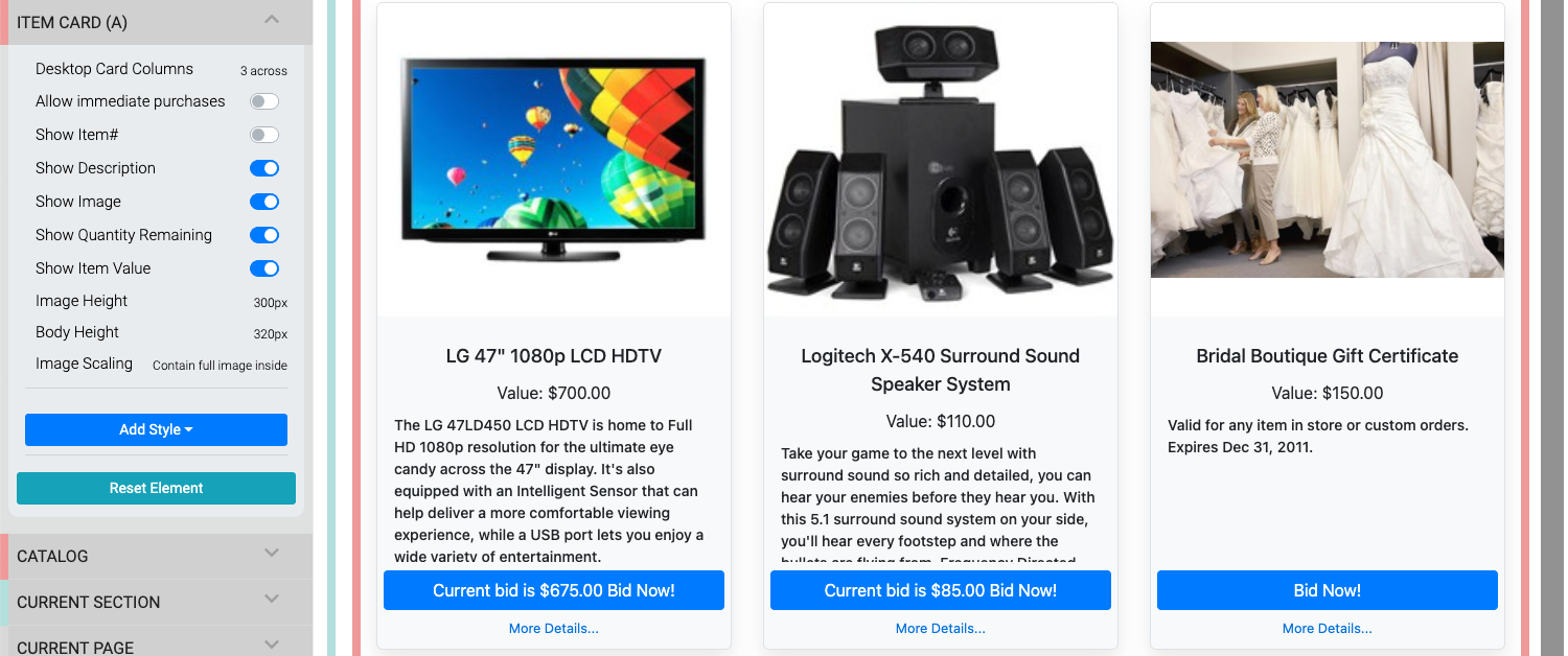
An example of the 3 across layout.
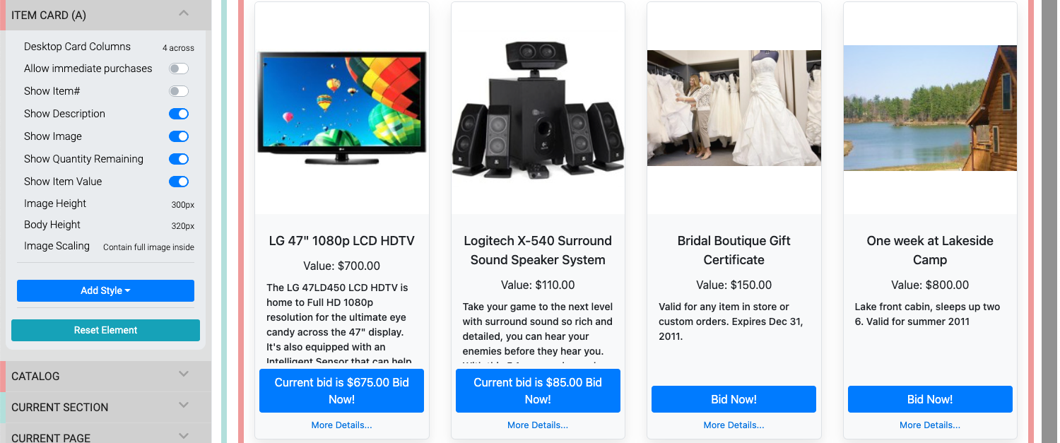
An example of the 4 across layout.
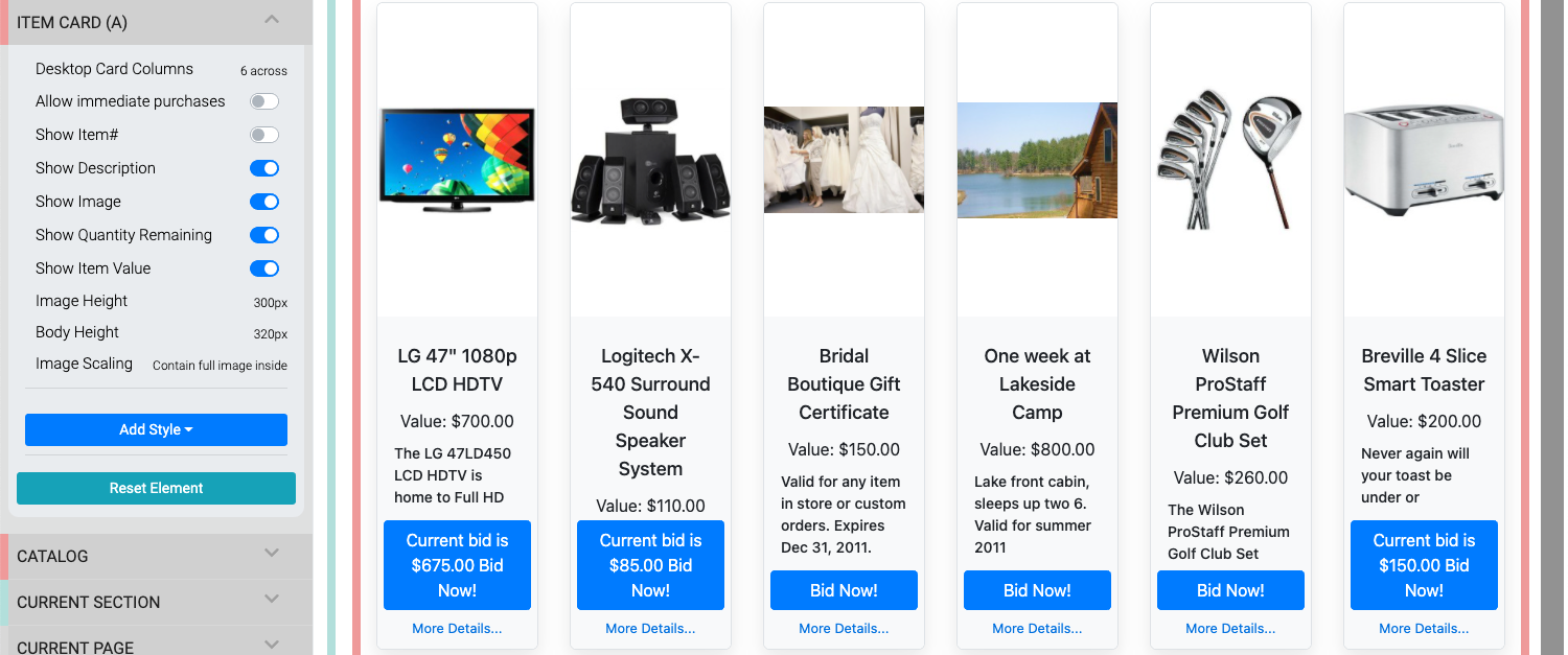
An example of the 6 across layout.
Last reviewed: February 2023