Image
Basic Content - Image Element
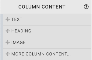
Dragging and dropping an Image element into a content space will start with a default image that should be modified to fit your auction event website page accordingly.
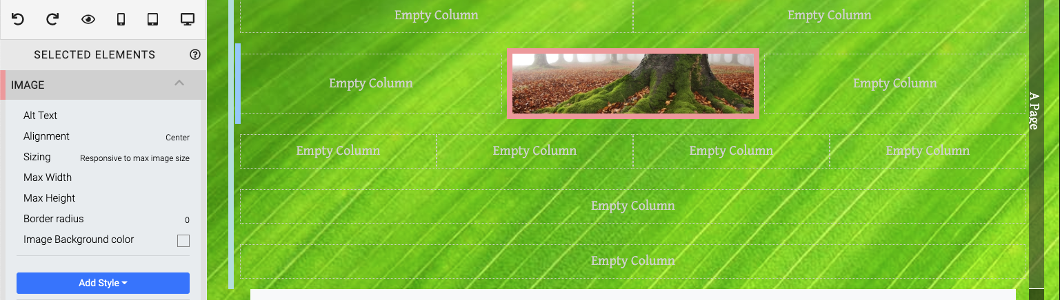
When the Image element is highlighted it will also be seen in the "Selected Elements" section of the Website Editor Sidebar.
INFORMATION
Clicking on an element in the "Selected Elements" section will toggle its property settings view.
Edit Image
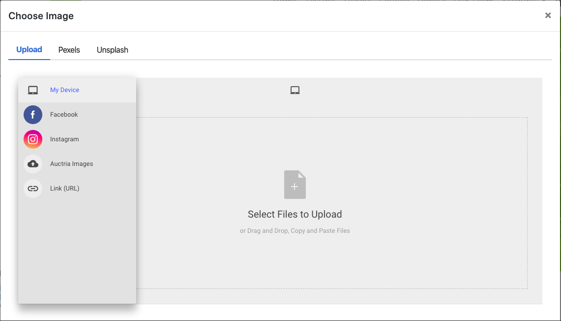
To change the image you can double-click the existing image, or click on the "cog" icon to display its action icons then click on the "pencil" icon to open the Choose Image window.
Clicking the Edit Element button will open the Choose Image window.
Once an Image element has been inserted, there are several properties available to further adjust the image as needed.
Alt Text
This specifies an alternate text for an image, if the image cannot be displayed. See w3schools.com for more information.
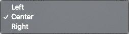
Alignment
The default is centered although you can change this via the drop-down options available.
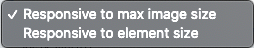
Sizing
Images are sized in a responsive manner to either the image itself or the container the image is inserted into.
The precise dimension is not critical (since screen sizes will vary) although a width roughly in the following ranges will work well in most cases:
- for "full-width" photos or images, a width of around 1200px is best;
- for "half-width" photos or images, a width around 600px should be used; and,
- page background images work well up to 1600px wide.
NOTE: In some cases, an image used as a "banner" may need to use the Responsive to element size option to best fit the container the Image element was inserted into.
Max Width
This limits the image width to the maximum value entered here.
Max Height
This limits the image height to the maximum value entered here.
Border Radius
When set, this will create a "rounded corners" effect for rectangular images. The greater the value the more rounded the corners will appear.
Image Background Color
See Background Color for more details on applying this property.
How To Make An Image Clickable
To Make An Image Clickable you will need to use its Add Behavior button in the Website Editor Sidebar.
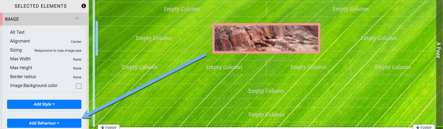
An example, image (with its properties open) showing the Add Behavior button.
1. Click On The Add Behavior Button
Clicking on the Add Behavior button will show the available properties.
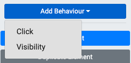
2. Click On The Add Behavior "Click" Option
In this case you would click on the Click property to add that behavior to the image.
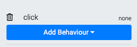
3. Click On The "click" Label
Clicking on the click label will open its Target option drop-down selector. Clicking on the trashcan icon will remove the property.
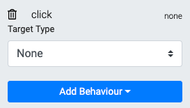
4. Click The Target Type
The Target drop-down selector allows you to choose where clicking the image will take the visitor.
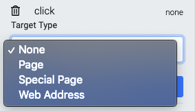
Selecting Page or Special Page will provide another drop-down selector to choose from existing pages on the auction website. Choosing the Web Address option will open a field where you would enter the appropriate URL for the click behavior as well as a checkbox to set if the link will open to a new page or stay within the same browser tab.
Website Editor SidebarAdd Behavior "Click" Behavior
Also see Common Element Actions for more details on managing the Image element.
Last reviewed: February 2023