Item Catalog
The Item Catalog row element is used to display your auction items. These items are generally taken from your "biddable" items (What Are Biddable Items?) although you can just as easily display Donation items or For Sale items or any combination of the above.
How Did I Get Here?
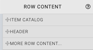
Row Content - Item Catalog
Drag and drop the Item Catalog from the Website Editor Sidebar directly into the row space you want to use. This will insert a default Item Catalog into that row space.
You can also drag and drop the More Row Content element from the Website Editor Sidebar into the row space where you want to add the Item Catalog. Using the More Row Content element will open the Choose Row window.
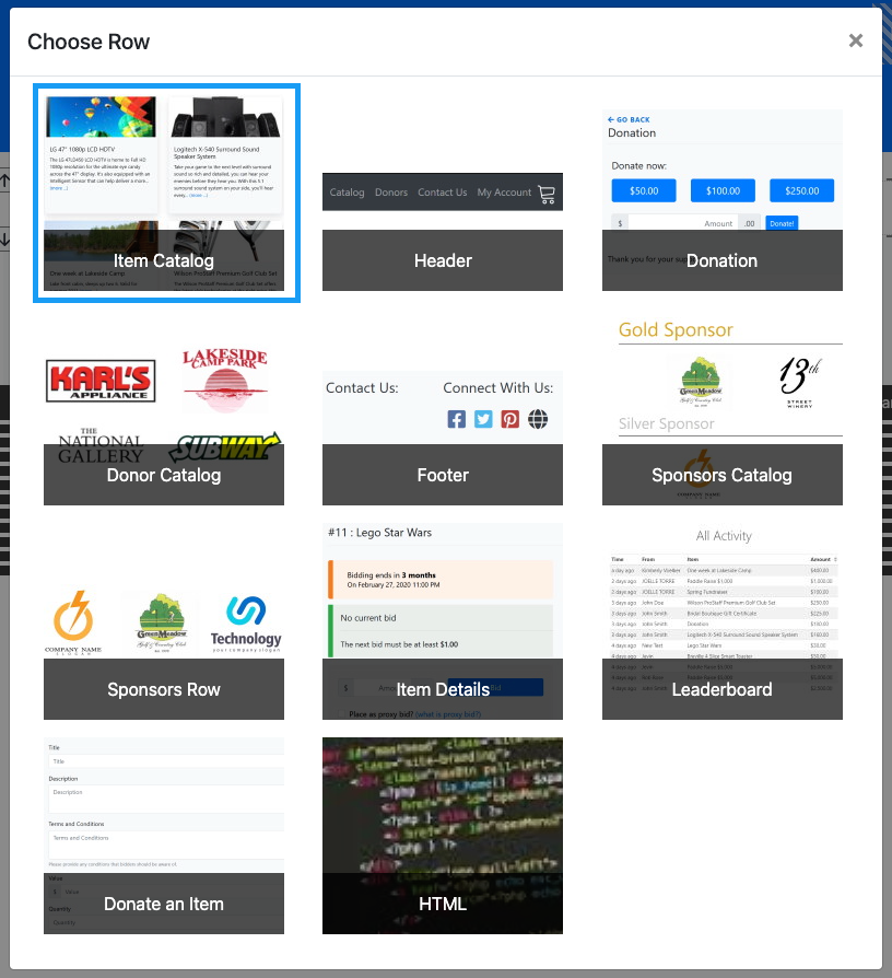
Clicking the Item Catalog element will now drop it into the row space you selected.
A common configuration of the Item Catalog is to use the Items with type condition (the default for this condition is to use the "biddable" types: Online, Silent, and Live). This may need to be modified to suit your auction needs. See Configure Items Displayed for more information.
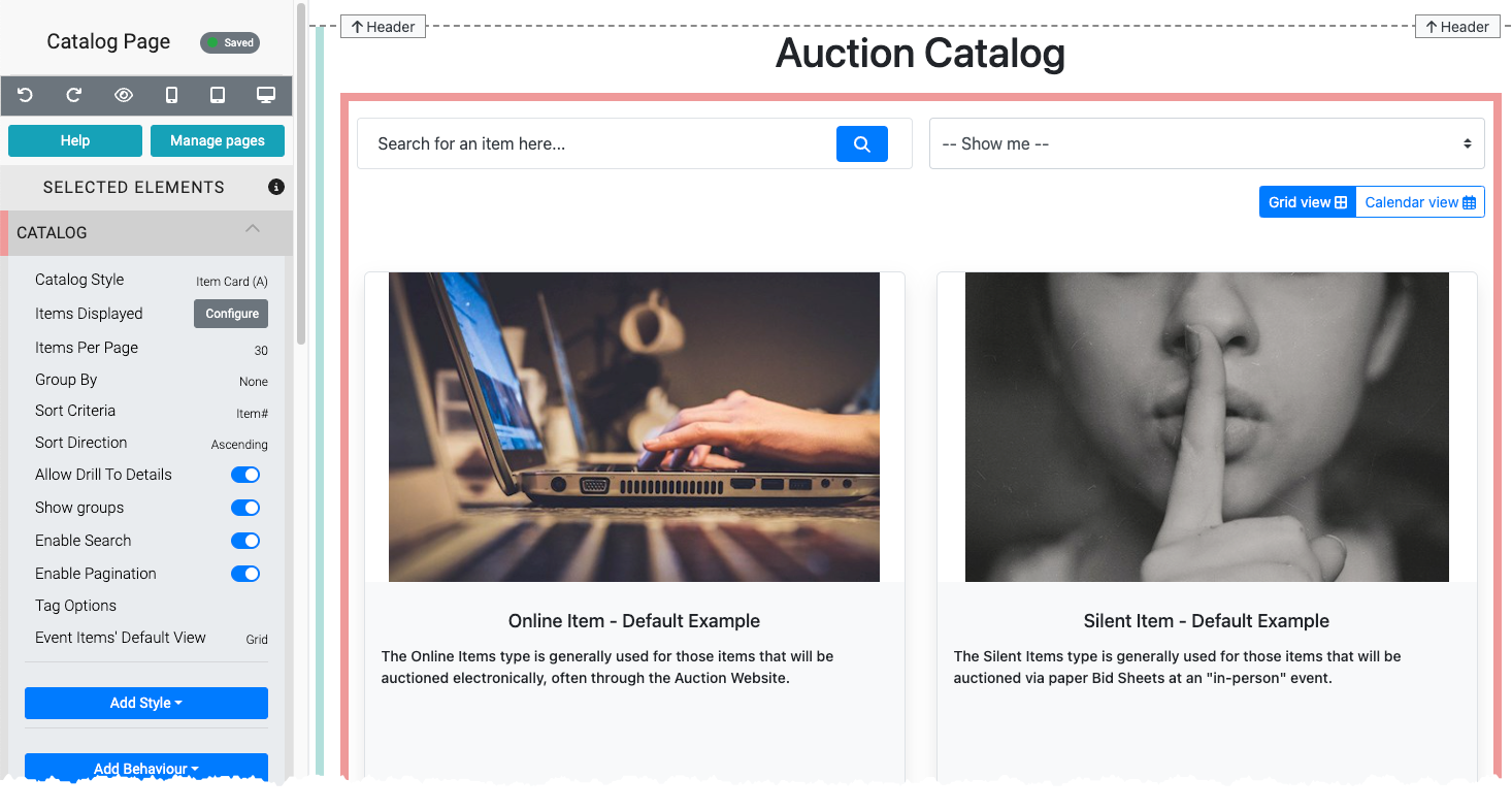
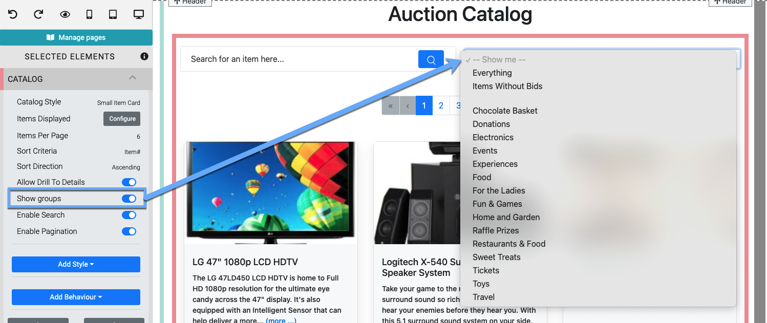
The Item Catalog displays several components by default.
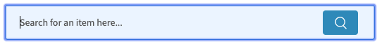
- A Search for an item here... search field.
- A Show Me... drop-down selector to filter items displayed (by group/category).
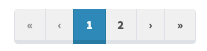
- Page navigation bars to move through the catalog when multiple pages are available.
- The item cards displaying the items configured to be shown in the catalog.
Edit Item Catalog
Catalog Style
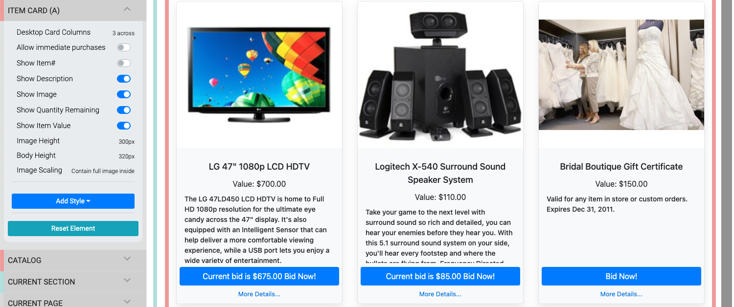
One of the most commonly edited pieces of the Item Catalog will be its Item Card and the configuration used as this affects all of the Item Cards being displayed in the Item Catalog.
See Item Catalog Style for more information on the available styles and their properties.
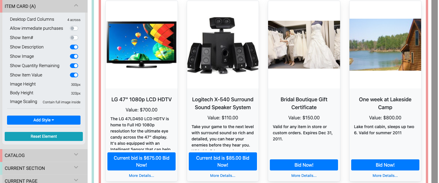
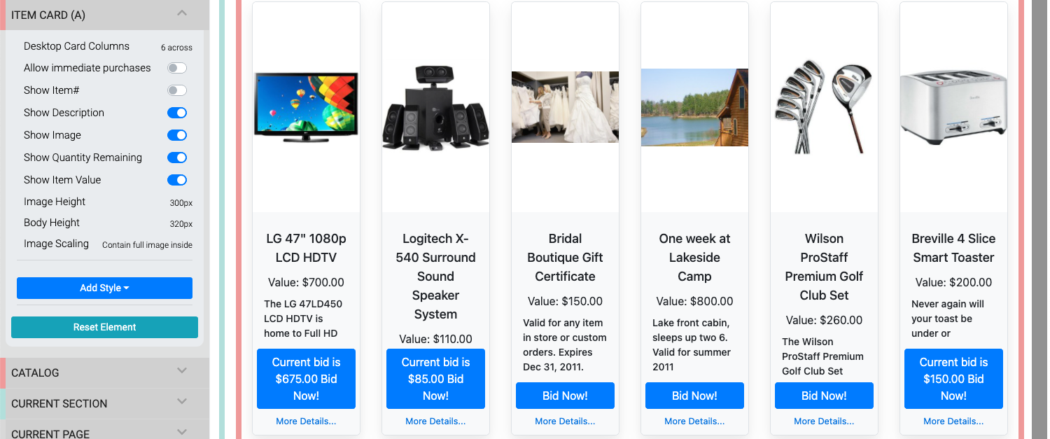
Desktop Card Column Examples
The Desktop Card Columns option is used with several Catalog styles in the Item Catalog. The default option for all styles using this property is 2 across (as seen above), below are examples of the 3 across, 4 across, and 6 across options.
Video: Change Catalog Image Size
Items Displayed
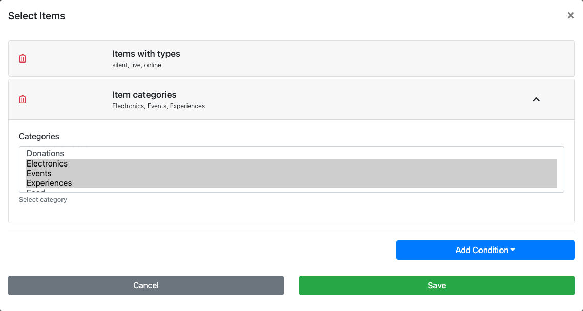
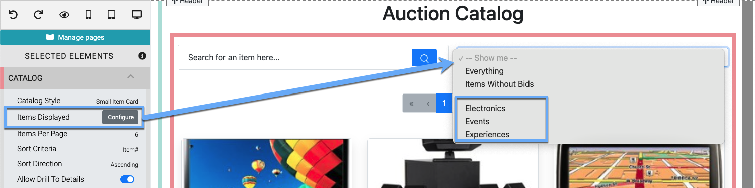
Clicking the Configure button for the "Items Displayed" setting will open the "Select Items" window.
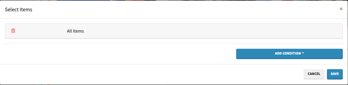
See Configure Items Displayed for more details.
Items Per Page
The Items Per Page sets the maximum number of cards to be displayed on a single item catalog page.
IMPORTANT
If Enable Pagination is disabled for the catalog, the Items Per Page value should be set to a minimum equal to, or greater than, the total number of items in the catalog or some items will not be displayed.
The Items Per Page value can be used to help with "filling" the rows of the Item Catalog when taken into consideration with the Catalog Style Desktop Card Columns options of "2 across", "3 across", "4 across", and "6 across".
Group By
By default, the Item Catalog does not have any specific grouping used. However, changing this Group by property from its default None to use the item Category, the item Event Start Time, or the item Event Location is possible.
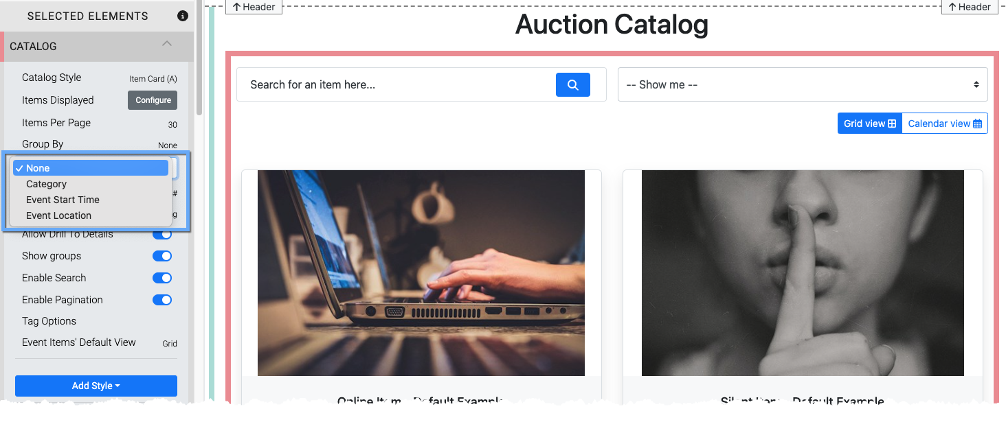
Note that individual groups will follow the set Sort Criteria for the Item Catalog within each group.
Sort Criteria
This option sets the Sort Criteria to use for the items displayed in the catalog. The default setting is for Item#. There are additional options available in a drop-down selector.
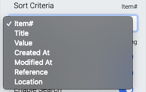
- Item# This is the default option and sorts the items displayed by their Item#
- Title This option sorts the items displayed in alphabetical order.
- Value This option uses the value set in the Item Details Summary tab.
- Created At This option will sort the items displayed based on their time they were created.
- Modified At This option will use the time the items displayed were last modified.
- Reference This option uses the Reference field from the Item Details Summary tab.
- Location This option uses the Location field from the Item Details Summary tab.
INFORMATION
If the Sort Criteria option selected has duplicate entries, such as when using Location, or the field is empty the items displayed will default to using their respective Item# as a secondary criteria to complete the sort process.
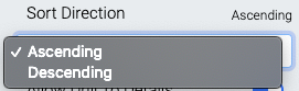
Sort Direction
This option sets the direction for the Sort Criteria to be displayed. The default is Ascending (lowest to highest) with an additional option of Descending (highest to lowest).
Allow Drill To Details
This toggles the (more...) text link in the item's description as well as the ability to click on an item card to view the item details.
This option must be enabled for Biddable Items (What Are Biddable Items?) to receive bids through the auction catalog.
Show groups
This toggles the "Show Me..." filter bar drop-down selector.
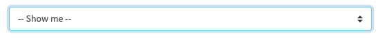
By default this will display all item categories that have been created for the event.
Configuring the Items Displayed using the condition Item Categories (see the Configure Items Displayed page for more details) will limit the drop-down selector to only display those specific categories selected in the condition.
Enable Search
This toggles the Search bar
Enable Paginations
This toggles the Page navigation bars at the top and bottom of the catalog.
Tag Options
The Tag Options property allows you to set publicly visible tags in the Item Catalog allowing visitors to filter the displayed items based on the tag options they choose.
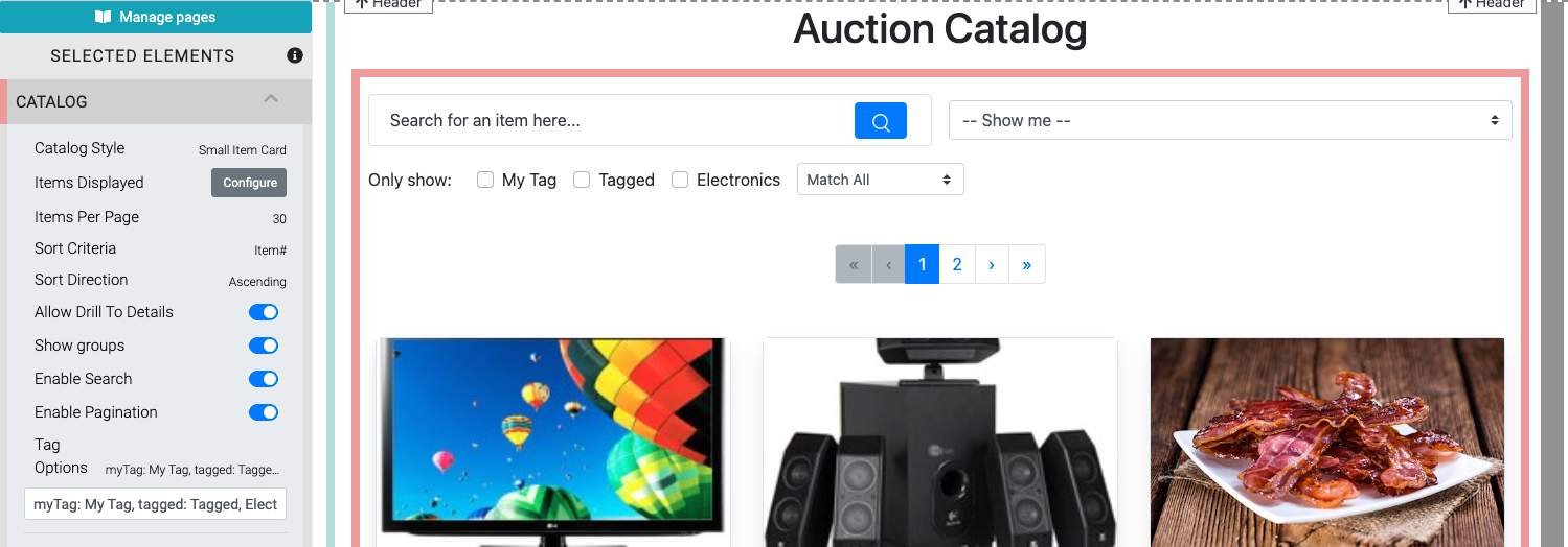
Once tags are set, they appear across the top of the Item Catalog with checkboxes to choose.
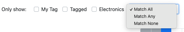
A drop-down selector handles the logical AND (read: Match All) and OR (read: Match Any) operations when filtering with these tags. The Match None option uses the logic of requiring none of the selected tags have been assigned to the item.
NOTE
Tags are manually set (read: typed into the options text field). Although they will use existing Where Tags Can Be Used In Auctria that have been set on the items they will not "auto-complete" when entering them into the Item Catalog properties. Remember to check your spellings.
You can improve the tag "readability" by optionally setting their display text in the Tag Options text field. For example, myTag: My Tag, tagged: Tagged, Electronics will only display My Tag, Tagged, and Electronics respectively in the Item Catalog but will use the tags myTag, tagged, and Electronics when filtering items.
Recommended Reading
See Where Tags Can Be Used In Auctria under the Learning Auctria section for more information about how Tags can be used.
Event Items Default View
When you are using the Item Catalog Condition for Scheduled Events only, the Item Catalog itself will provide the Event Items Default View option, allowing you to set the initial view a visitor will see when they land on an auction website page using the specific Item Catalog.
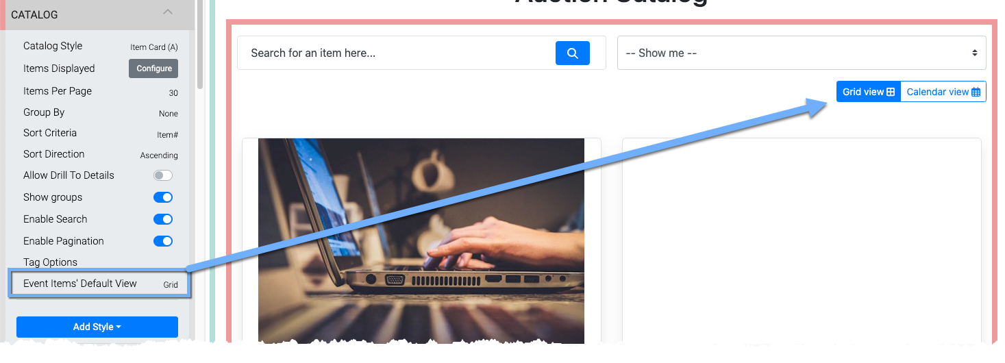
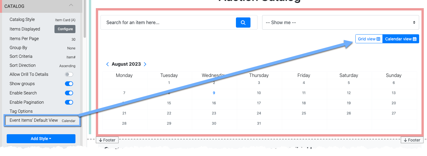
Note that no matter which option you choose for the Item Catalog, visitors to the auction website can toggle the view by clicking on the appropriate button.
Item Details
Clicking on an Item Card will access the Item Details page element.
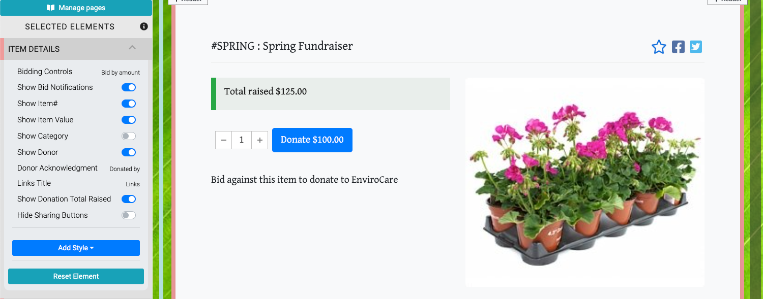
Bidding Controls
The Bidding Controls option handles how bids are made for the item on its details page. The default is Bid by amount.
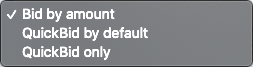
- Bid by amount provides an open field for the bidder to enter an amount to bid on the item.
- QuickBid by default sets the next bid as the current bid plus the Bid Increment (or Starting Bid as the case may be -- see Items Details Bidding Rules for more information) in a button and provides an open field for the bidder to enter their own amount.
- QuickBid only is the same as QuickBid by default without the open bidding field.
Show Bid Notifications
This toggles if Bid Notifications are displayed on the Item Details element page. This option is mostly only used with Virtual Live Gala events.
Show Item#
This toggles the display of the item number and the item description in the Item Details element.
Show Item Value
This toggles the display of the item value in the Item Details element.
Show Category
This toggles the display of the item's Category if one exists.
Show Donor
This toggles the display of the Donor section under the item image carousel space.
Donor Acknowledgement
This allows you to change the text used for the Donor Acknowledgement space.
Links Title
This field is used as the heading for the section where the item's Images and Links appear.
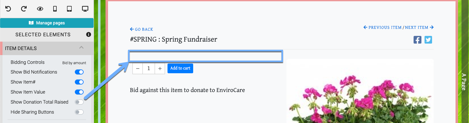
Show Donation Total Raised
This toggles the display of the "Total raised..." element displayed below the item title.
Hide Sharing Buttons
This toggles the display of the social sharing icons, if they are configured, in the Item Details element. See Social Media for more information on adding these sharing icons.
Star An Item
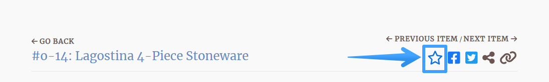
Registered Participants will be able to Star an Item when they select it in the Item Catalog and view the Item Details element. Participants can filter the Item Catalog to only display Items they have Starred.
The Item Details element is typically found as a sub-component of the Item Catalog / Item Details Container element although it can be used as an individual element to highlight a single "focused" item.
See Item Details for more in-depth information on this component.
Also see Common Element Actions for more details on managing the Item Catalog.
Show Quantity Remaining - This property only applies to For Sale Items with the Online Purchase Behavior - Immediate Payment Only option selected.
In this section:
Last reviewed: August 2023