Header
Row Content - Header
By default, when a website is created in Auctria it will have a Header element already inserted.
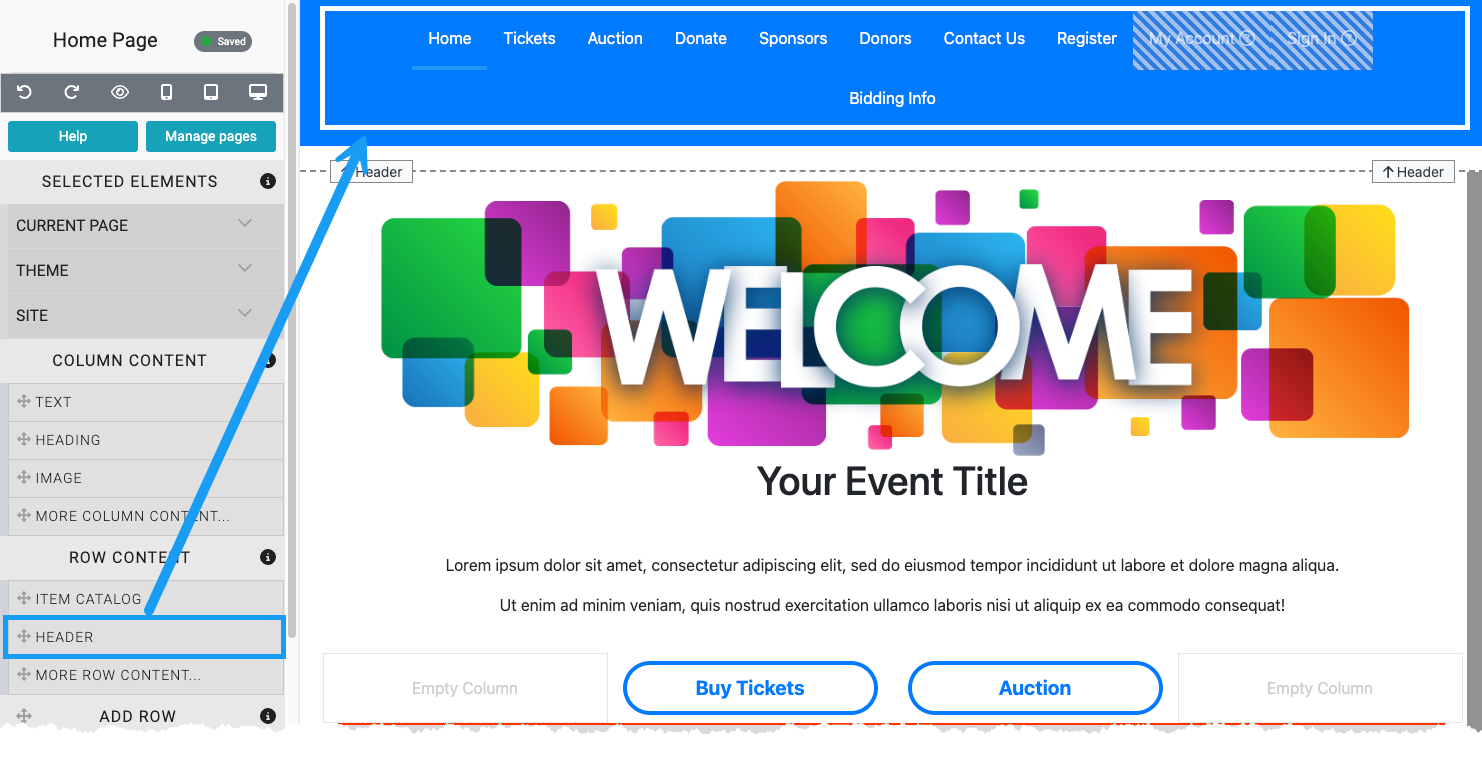
Dragging and dropping a Header element into a row space will add a menu item to your website. The Header element is best used in the Header section of the website as a common location for a menu to be found. The Header element can be inserted into any section of the website.
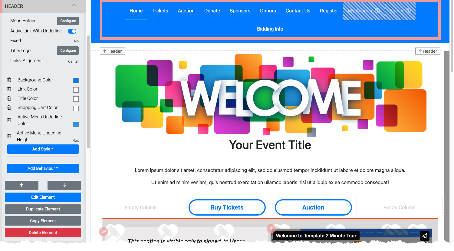
Menu Entries
Clicking the "Menu Entries" Configure button will open the "Header Links" window.
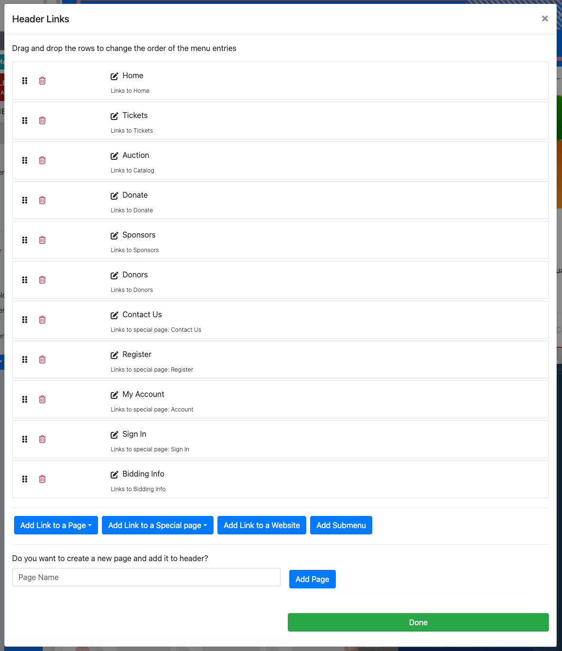
Add Link To A Page
This will allow you to add a link to an existing page (as listed in the Header Links -- not all pages will always have a link showing in the menu all the time).
Add Link To A Special Page
Special Pages are system generated to make inserting their relevant content easier for the organizer to add to their event website. See Special Pages for more details.
Add Link To A Website
Using the Add Link to a Website button will insert a Header Link that can be edited to point to an external website URL.
Add Submenu
Clicking the Add Submenu will insert the submenu Header Link entry. This can then be edited as needed.
Add Page
Entering a Page Name into the text field and clicking on the Add Page button will create a new blank page for the event website.
Read More
See How To Configure Menu Entries for more details.
Active Link With Underline
This toggles an Underline to appear beneath the active menu item (the current page being viewed). This can be further styled by using properties found in the Add Style section of the Header element.
Fixed
The Fixed option allows you to pick from a drop-down selector that can force the menu to be used within the header (the default setting No), or fixed at the Top or Bottom of the web site page and always be visible when scrolling.
Title/Logo
Clicking the Configure button will open the Select Title window.
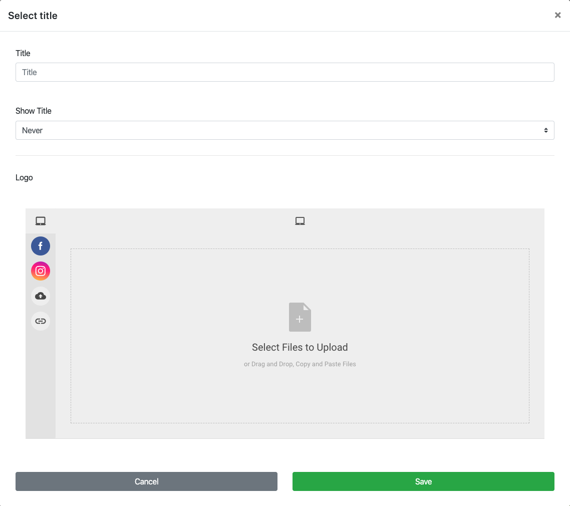
Title
This is the menu Title reference.
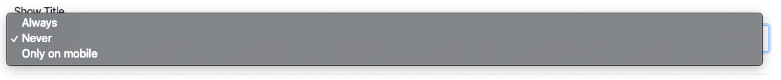
Show Title
This option provides a drop-down selector for when the menu title should be displayed. The default is Never.
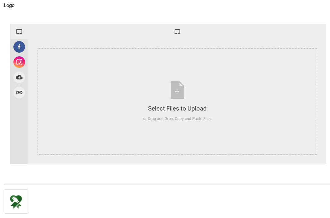
Logo
This section contains a file picker that allows you to select a Logo image to be used within the menu. The logo is aligned to the left. Once a logo has been "uploaded" it will appear as a thumbnail beneath the Logo file picker.
TIP
Once a Logo has been added it will always display in the Header element. To remove the Logo hover over the thumbnail and click on the "trashcan" icon that appears.
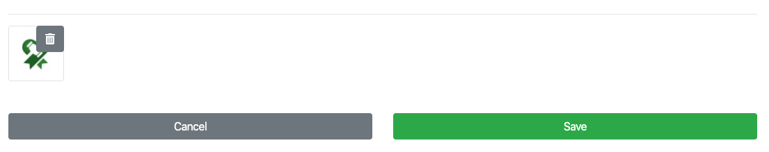
Clicking on the "trashcan" does not require you click on the "Save" button.
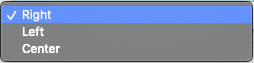
Links' Alignment
This option sets the overall alignment of the menu items. The default is Right.
Add Style
The Header element has several menu specific style properties that can be edited.
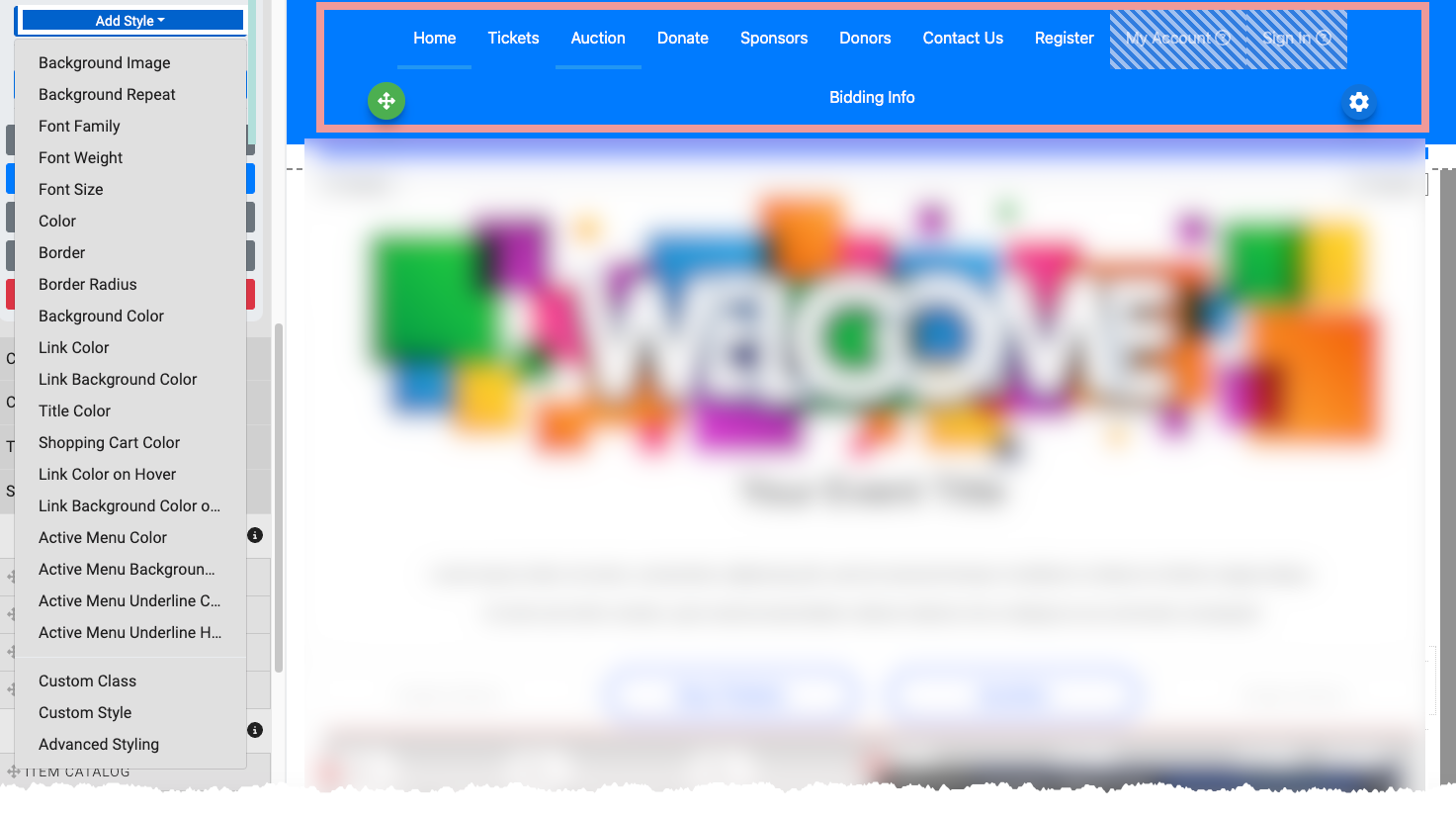
Some of the more commonly considered style options would be the following.
- Active Menu Background Color This sets the background color of the active menu item (the current page being viewed).
- Active Menu Color This sets the font color of the active menu item (the current page being viewed).
- Active Menu Underline Color This sets the color of the line when the Active Link With Underline option is enabled.
- Active Menu Underline Height This sets the thickness of the Underline when the Active Link With Underline option is enabled.
- Shopping Cart Color This sets the color of the shopping cart "icon".
Read More
See Common Element Actions and Add Style for more details.
In this section:
Last reviewed: January 2024