Button
Basic Content - Button
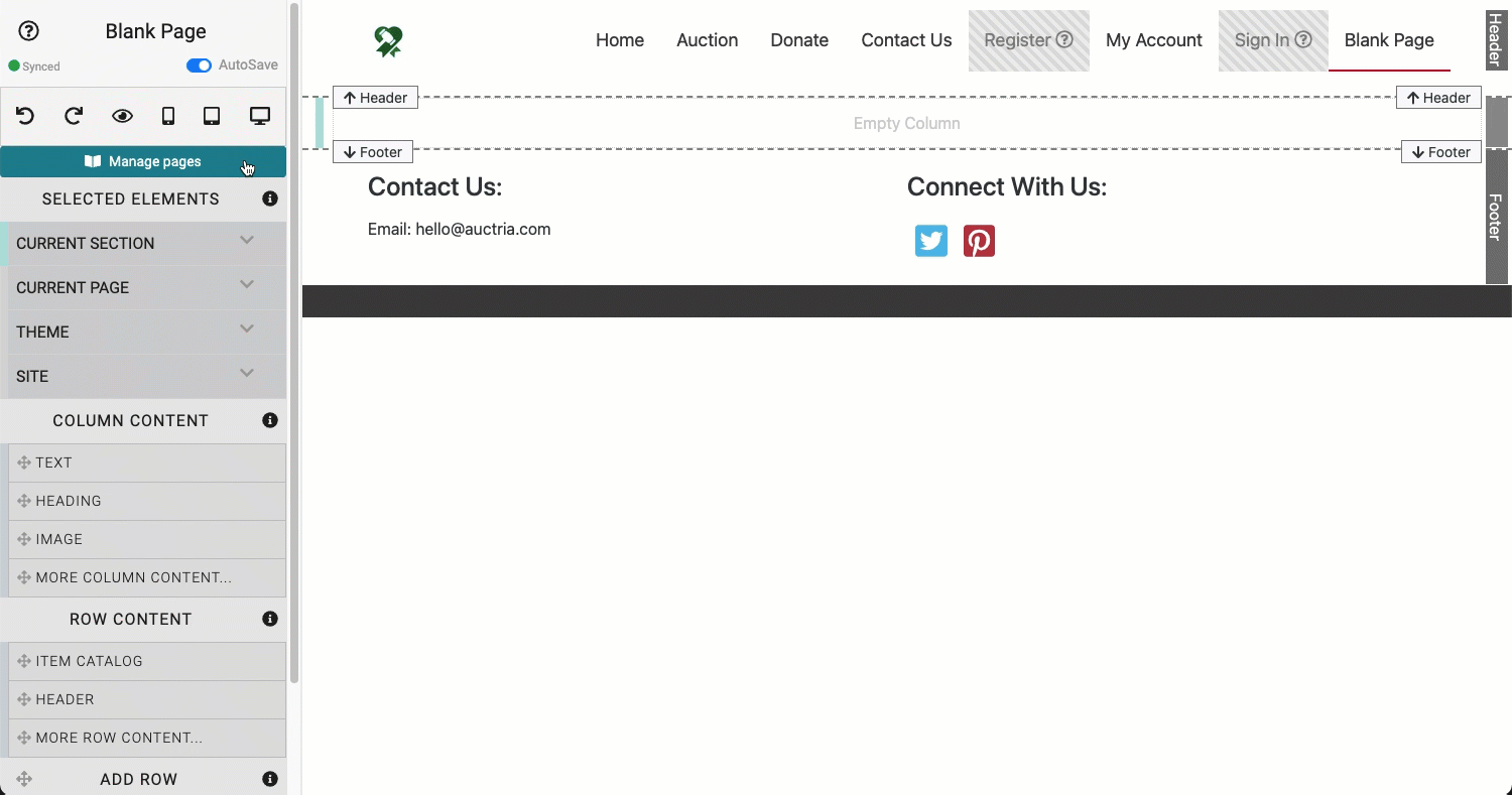
An example of adding a default Button to a "blank" page.
Drag and drop the More Column Content element from the Website Editor Sidebar into the column space where you want to add the Button.
INFORMATION
Buttons are often "clickable". Use the Add Behavior settings to assign a "Click" action. See How To Add A Button Linked To A Page for more information.
Add New Row
If there is no Row for you to insert your Column element into, you can drag-and-drop the Add Row element from the Website Editor Sidebar into the existing section, select the number of columns you want in the row, then add the column element as needed.
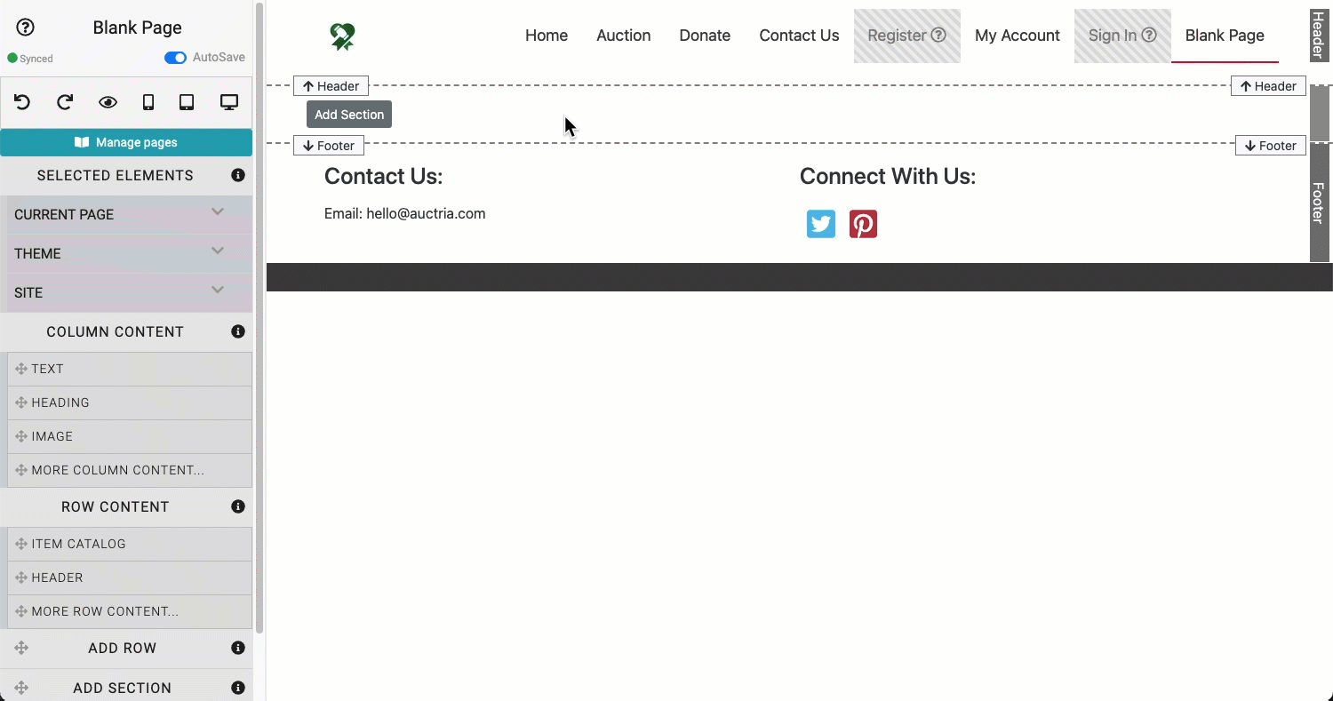
An example adding a new section and a new row to a blank page.
Also see Add New Row for more information on how to add a new row to an auction website page.
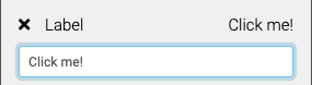
Edit Button Label
The Label is the text that appears on the button face. Clicking on the Label property will open its text field for editing. Click on the Label property again to close. Changes are automatically saved. Click on the x beside the Label property to clear the text field.
Configure Color and Style
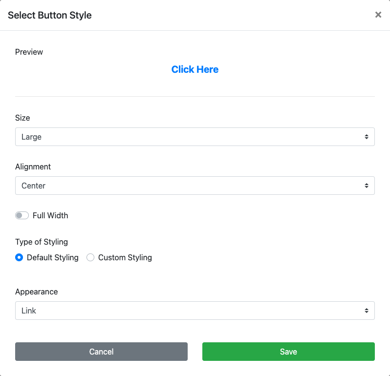
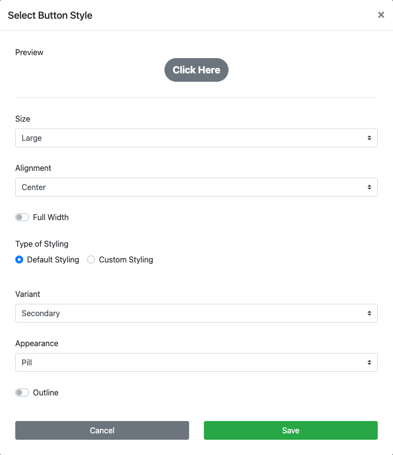
Clicking on the Configure button will open the Select Button Style window where you can adjust the look of your button and also see a preview of your changes.

The Select Button Style window opened by clicking the Configure button.
Preview
The Preview area displays a dynamic view of the button as changes are made.
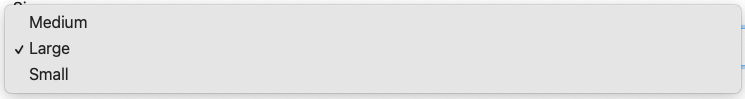
Size
This option uses a drop-down selector to choose from a predefined font size list. The size selected will adjust the overall button size.
- Medium - uses a "medium" font size.
- Large (default) - uses a "large" font size.
- Small - uses a "small" font size.
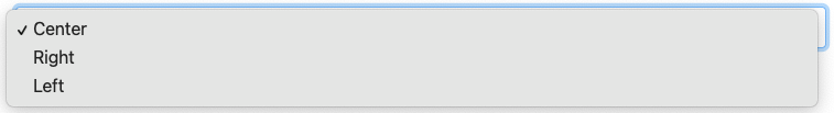
Alignment
This option uses a drop-down selector to choose from a predefined list. By default, the button Alignment will be "centered". Alignment can be set to Center, Right, or Left.
Full Width
A toggle to use the full width of the content block (default is disabled). NOTE: the Alignment option is only applied when the Full Width option is toggled off.
Default Styling
The Type of Styling is either the Default Styling option or the Custom Styling option. These are selected by clicking on the appropriate radio button. Default Styling uses colors based on the current theme color palette.
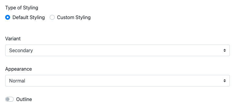
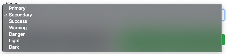
Variant
The Variant option allows you to choose from the current theme color options with the default as Secondary.
Appearance
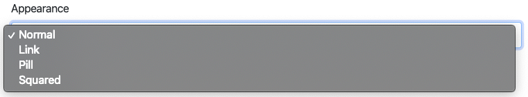
The Appearance drop-down selection allows you to change the shape of the button. The options are Normal (default), Link, Pill, or Squared.
Some Appearance options may limit other available style options for your button. For example, the "Link" selection does not use the "Outline" property.
Link will make the button appear as text only.
Pill will make the button appear with rounded ends.
Squared will make the button appear as a block.
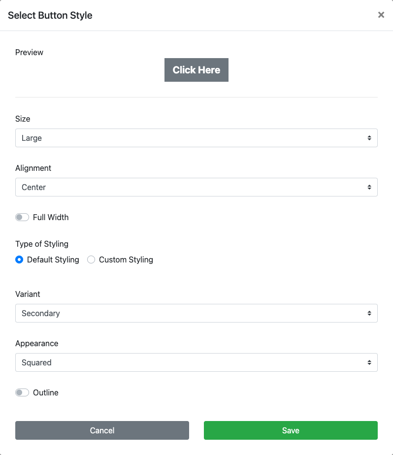
Outline
The Outline toggle will switch the color of the text with the button color and show the button outline.


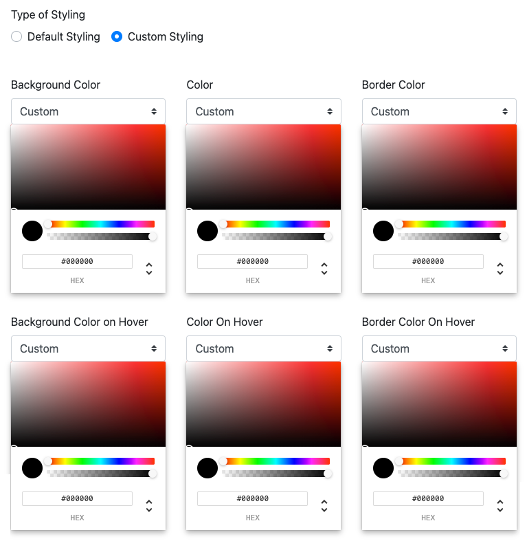
Custom Styling
NOTE
Custom Styling will only use the Normal button Appearance shape; and, there are no Default Styling options available. The two "styles" are independent of one another.
Changing to the Custom Styling option opens a selection of Color Picker panels to adjust the colors of the button independently and specifically for the button being edited.
Video: Website Editor Add Button
Also see Common Element Actions and Add Behavior for more details and information on managing the Button element.
Last reviewed: February 2023