Video
Basic Content - Video
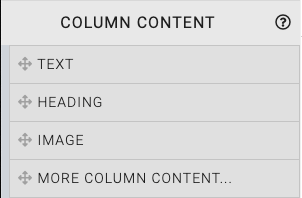
Drag and drop the More Column Content element from the Website Editor Sidebar into the column space where you want to add the Video element.
This will open the Choose Content window.
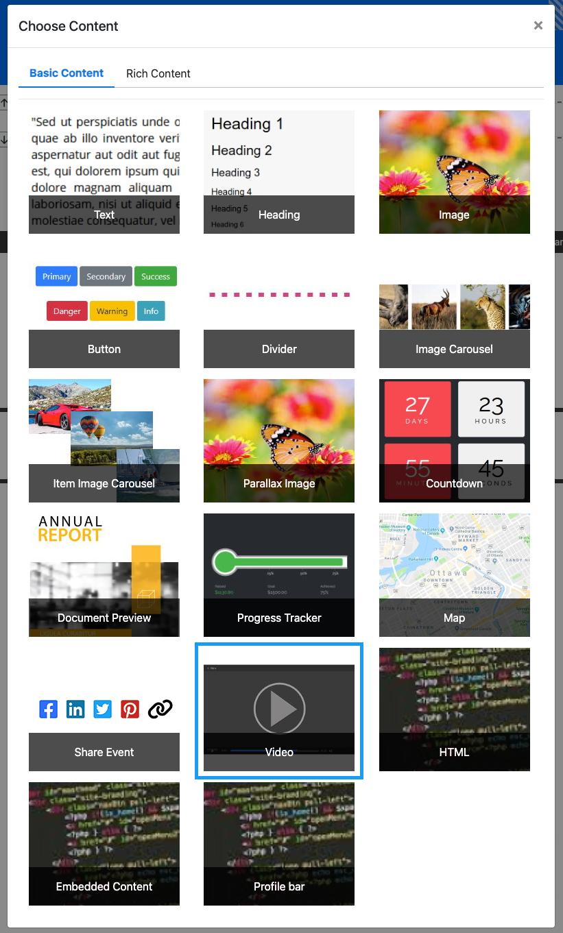
Clicking the Video element will now drop it into the column space you selected. The element will start with a default video that should be modified to fit your auction event website page accordingly.
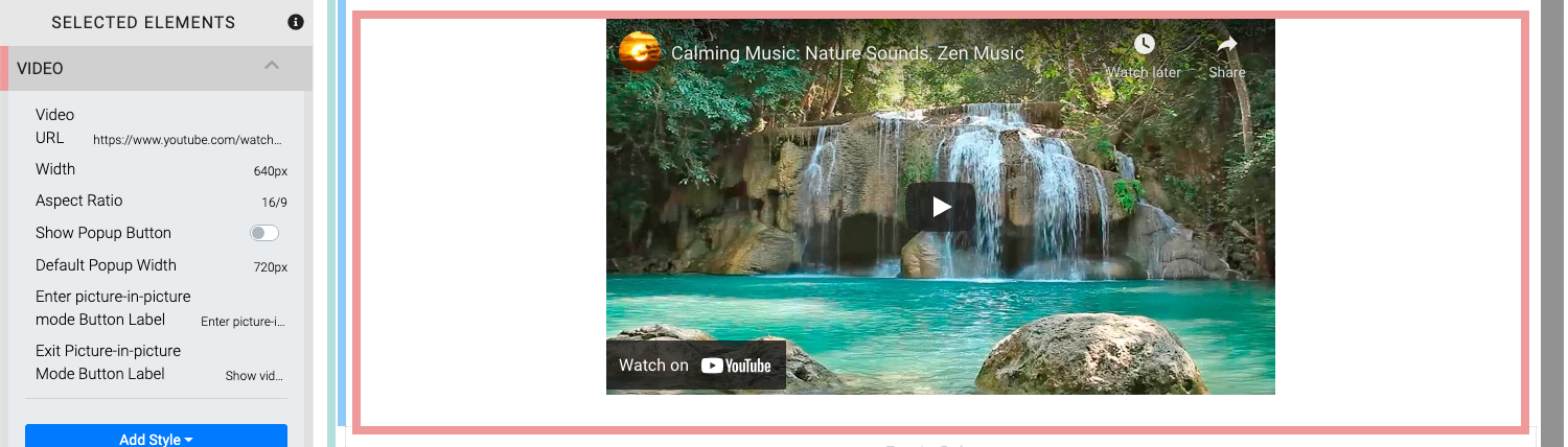
When the Video element is highlighted it will also be seen in the "Selected Elements" section of the Website Editor Sidebar. Clicking on "Video" in the "Selected Elements" section will open up its settings.
Edit Video
Several properties and options are available for the Video element.
Video URL
You can enter the Video URL directly in this field or you can use the "pencil" icon after clicking the video elements "cog" icon to edit the Source and Video Id individually.
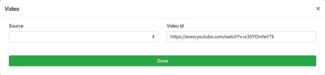
Source
This is the video service support in the element. Currently only the YouTube and Vimeo sites are supported in the drop-down selector.
Video Id
This field can be used for the Video ID. You will only need to enter the video's specific ID and not its entire URL when using the Source drop-down selector. Optionally, you can leave the Source field blank and enter the full video URL into this field.
Width
This is the width of the video being displayed. The default is 640px.
Aspect Ratio
This is the aspect ratio of the video and will be used to calculate the video height based on the Width value. The Aspect Ratio is set by selecting it from a drop-down selector. The default is 16/9.
Show Popup Button
The Show Popup Button toggle will enable the display of a button for auction website visitors to click to make the video a free floating "picture-in-picture" style element on the website. This is disabled by default.
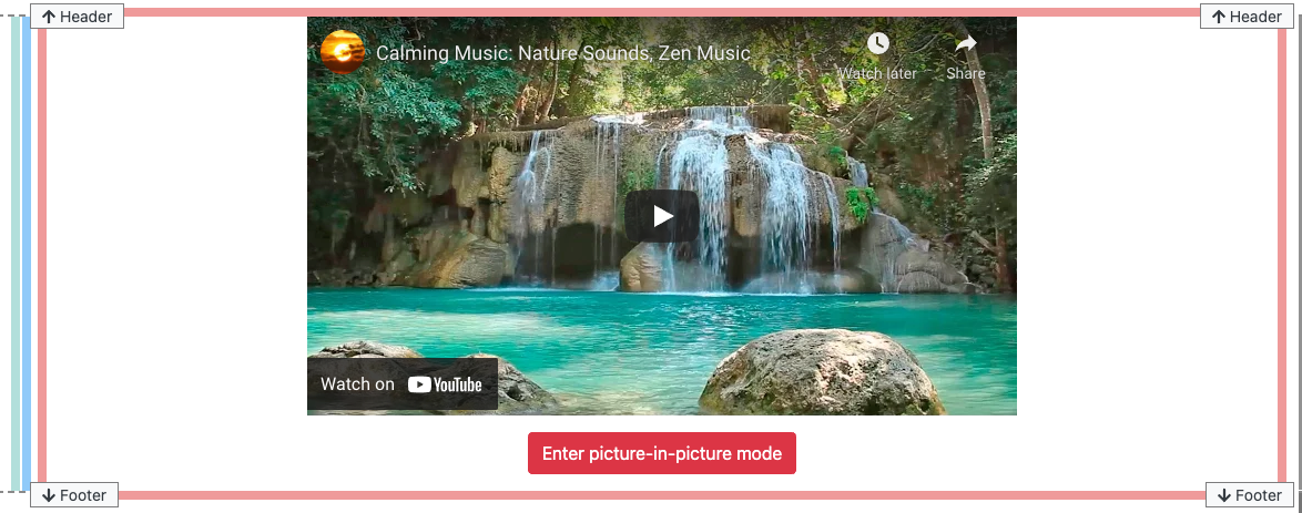
An example of the "Popup Button" using the default label text.
Default Popup Width
This is the default width of the video after the visitor to the website has clicked the Enter picture-in-picture mode button.
NOTE
Although you can set the Default Popup Width value to be very wide the pop-up video will be contained appropriately within the current browser window.
Enter picture-in-picture mode Button Label
The Show Popup Button label text can be modified as needed to provide a label more relevant to your event with this property. The default is Enter picture-in-picture mode.
Exit Picture-in-picture Mode Button Label
With the "picture-in-picture" style enabled for the video, the original Enter picture-in-picture mode labeled button will be changed to use the text set with this property. The default is Show video inline.
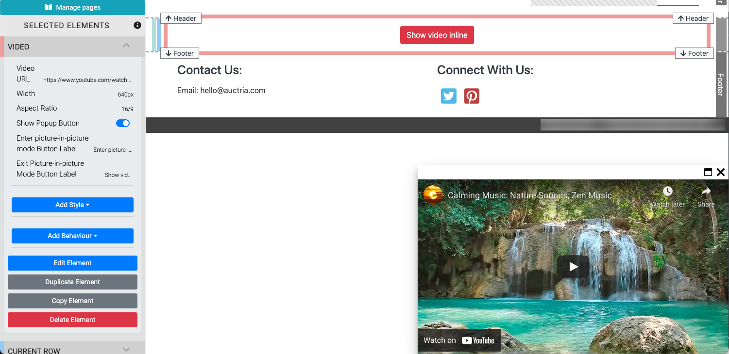
An example showing the default "Show video inline" button label as well as the default location of thevideo using the "picture-in-picture" style. The video can be moved freely in the browser window.
Live Streaming Support
Please see the Live Streaming Services section under Unknown link 'WorkingWithWebsites' for more information on how to use Live Streaming options available on the Auctria platform.
Recommended Reading
See Common Element Actions for more details on managing the Video element.
Last reviewed: February 2023