Sponsors Catalog
Row Content - Sponsors Catalog
Drag and drop the More Row Content element from the Website Editor Sidebar into the row space where you want to add the Sponsors Catalog.
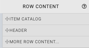
This will open the Choose Row window.
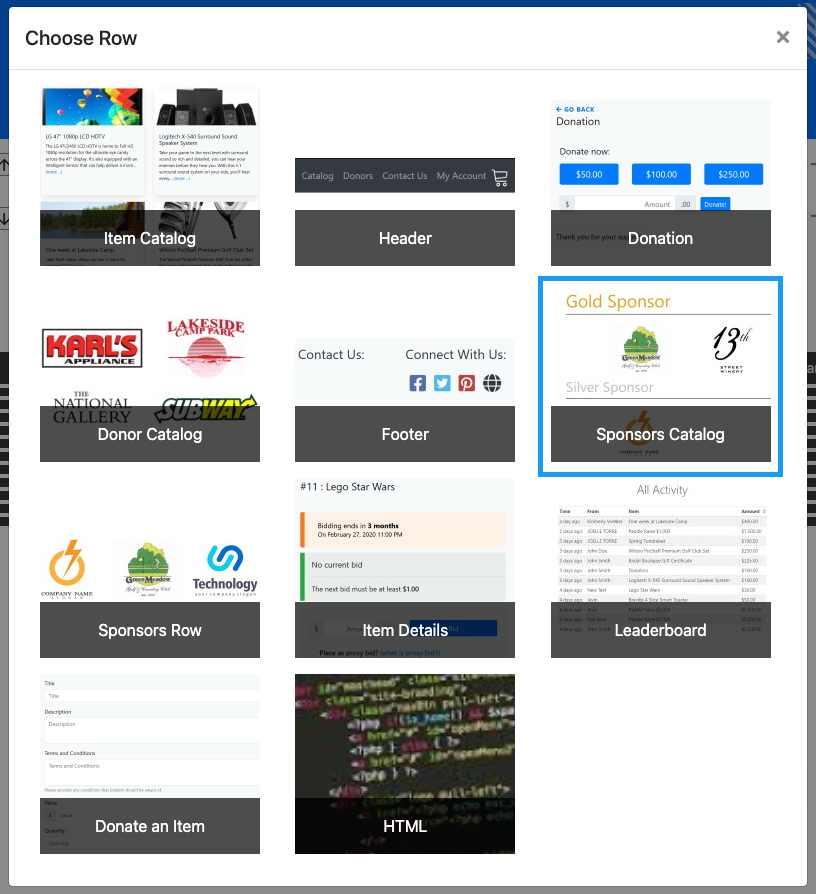
Clicking the Sponsors Catalog element will now drop a Sponsors Display element into the row space you selected. The element will start with a default "All Sponsorships" configured catalog. This may be modified to fit your auction as needed.
The Sponsor Display section shows a collection of the event sponsors. This element is very similar to the Sponsors Row.
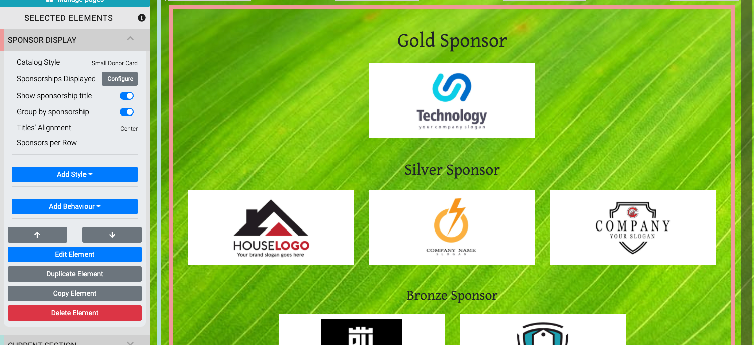
An example taken from the Auctria Demo site.
Edit Sponsor Display
The Sponsor Display has several properties that can be used to customize the element.
Catalog Style
The Catalog Style provides for a drop-down list of options available to be used with the sponsor cards that are displayed.

Sponsorships Displayed
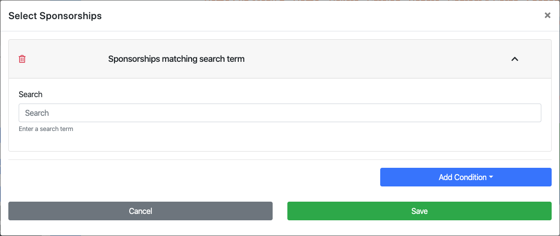
Clicking on Configure will pop open the Select Sponsorships window.

The Add Condition drop-down selector allows you to further modify and customize which sponsors or donors are displayed.
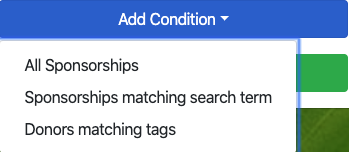
Some "Conditions" may have their own properties. Clicking on the specific condition will open its properties dialog if it has any that can be modified.
Show sponsorship title
The Show sponsorship title toggle hides or displays the name of the sponsorships you have created.
Group by sponsorship
The Group by sponsorship toggle will adjust the display to fill the content container with the sponsor cards as well as hide the "sponsorship tile" (regardless of the Show sponsorship title setting).
Titles' Alignment
This property will align the sponsorship name over its respective sponsorship grouping.
Sponsors per Row
This property allows you to set the number of Sponsors per Row within each grouping of sponsorships. The number of sponsors per row can also be set to different numbers by using a comma-separated list such as 2,3,4 where this example would display two sponsors in the first row, then three sponsors on the next row, and four sponsors on the third row (and each additional row). Also to note, 4 is the maximum value you should use for the number of rows.
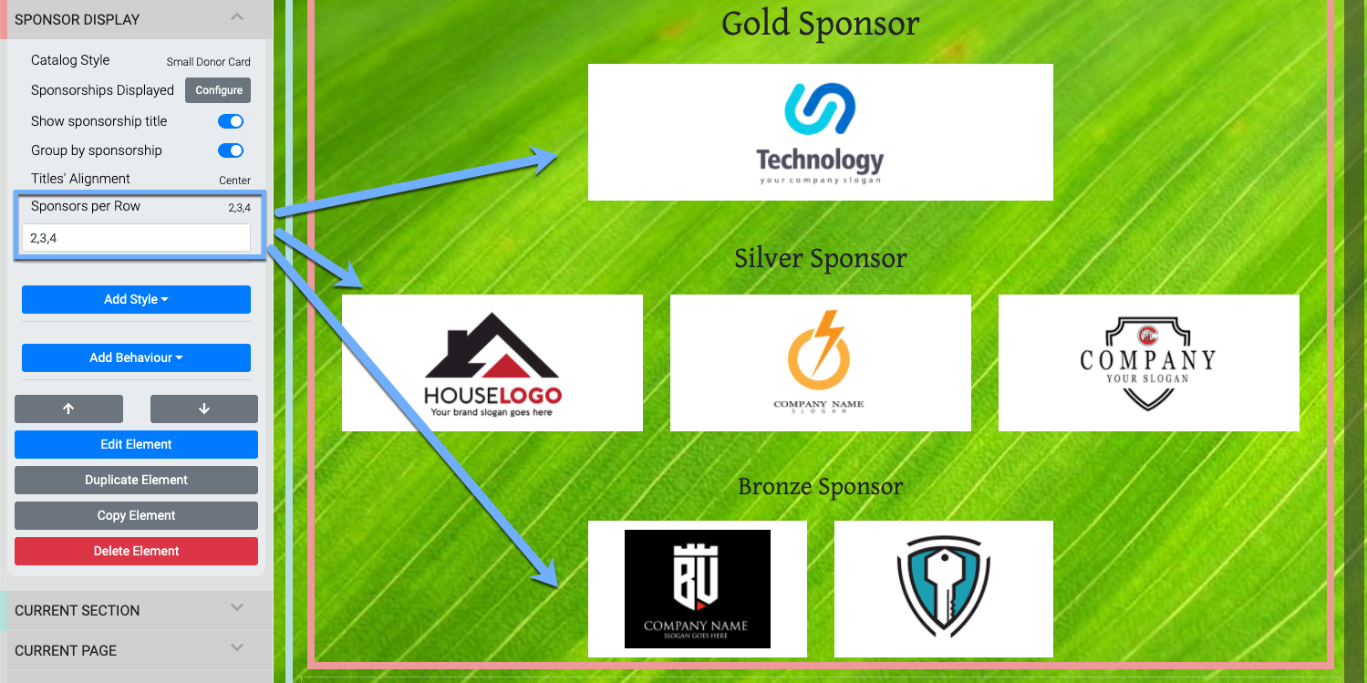
An example taken from the Auctria Demo site (see above for the "before" look).
NOTE
Sponsor logos are always centered across the rows. If there are not enough sponsors to "fill" a row, the existing sponsor logos are still sized as if there are enough to fill the row all the same. This provides for a hierarchal display of the sponsors no matter their numbers.
Sponsorship Card
Clicking on a Sponsor section title will provide access to the Sponsorship Card element for the Sponsor Catalog.
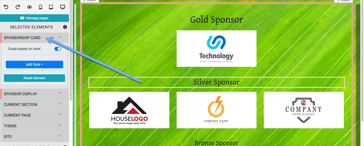
An example carrying forward from the above example Auctria Demo site.
The Sponsorship Card provides for the additional relative styling for the Sponsor Catalog element.
- Scale based on level adjusts the "tier" titles to be relatively sized compared to the other titles.
- Add Style provides access to the Introduction To Advanced Styling options.
- Reset Element will revert all changes to this element and set it to its initial default settings.
Donor Card
Clicking on a specific sponsor and/or the blue "target" icon visible when hovering over the sponsor will select the Donor Card element.

Edit Donor Card
INFORMATION
When editing one donor card you will be affecting all donor cards in the element.
- Show image This toggle will show or hide the sponsor/donor image.
- Show Name This toggle will show or hide the sponsor/donor name.
If a Company name has been set for the sponsor, it will be used when this property is enabled, overriding the bidder's Name fields.
- Image Height This value (which requires a unit of measure) will affect the height of the image displayed.
- Image Scaling This provides a drop-down selector to set how the image will be scaled within the element.
- Contain full image inside (default)
- Enlarge image to cover
Recommended Reading
See Common Element Actions for more details on managing the Sponsor Catalog.
Last reviewed: October 2024