Item Image Carousel
Basic Content - Item Image Carousel
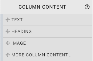
Drag and drop the More Column Content element from the Website Editor Sidebar into the column space where you want to add the Image Carousel.

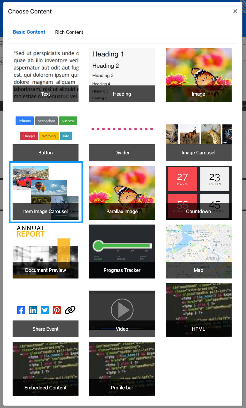
This will open the Choose Content window.

Clicking the Item Image Carousel element will now drop it into the column space you selected. The element will start with default "carousel" of images that should be modified to suit your event.

When the Image Carousel element is highlighted it will be seen in the "Selected Elements" section of the Website Editor Sidebar. Clicking on "Image Carousel" in the "Selected Elements" section will open up its settings.
Edit Item Image Carousel
Items Displayed
The Items Displayed Configure button will open the same interface as the Configure Items Displayed options and will be used in the same way to choose the default images from the items that meet the Conditions set.
Allow Click To Navigate
The Allow Click To Navigate option toggles the ability to click on the current image and be taken to its item.
Image Height
This value controls the overall height used by the Item Image Carousel element. The default is 300px.
Image Scaling
- Enlarge Image to cover - expands image to fit "Image Height".
- Contain full image inside - reduces image as needed to fit within image container (default).
Speed (ms)
This sets the speed at which the stage image will change (measured in milliseconds). The default is 3500 (equivalent to 3-1/2 seconds).
Transition time (ms)
This sets the amount of time taken to fade from one stage image into the next (measured in milliseconds). The default is 500 (equivalent to 1/2 second).
INFORMATION
In some rare cases, a page refresh may be required after saving changes to the settings.
Also see Common Element Actions for more details on managing the Item Image Carousel element.
Last reviewed: October 2024