Divider
Basic Content - Divider
Drag and drop the More Column Content element from the Website Editor Sidebar into the column space where you want to add the Divider.
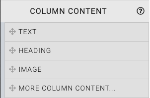
This will open the Choose Content window.
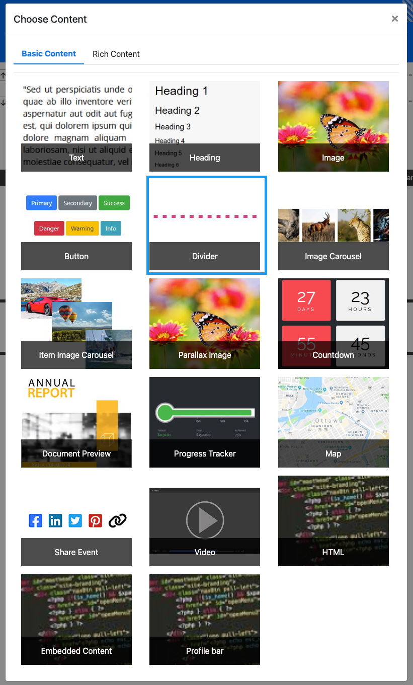
Clicking the Divider element will now drop it into the column space you selected. The element will start with a default solid black line. This can be modified to fit your event website page as needed.
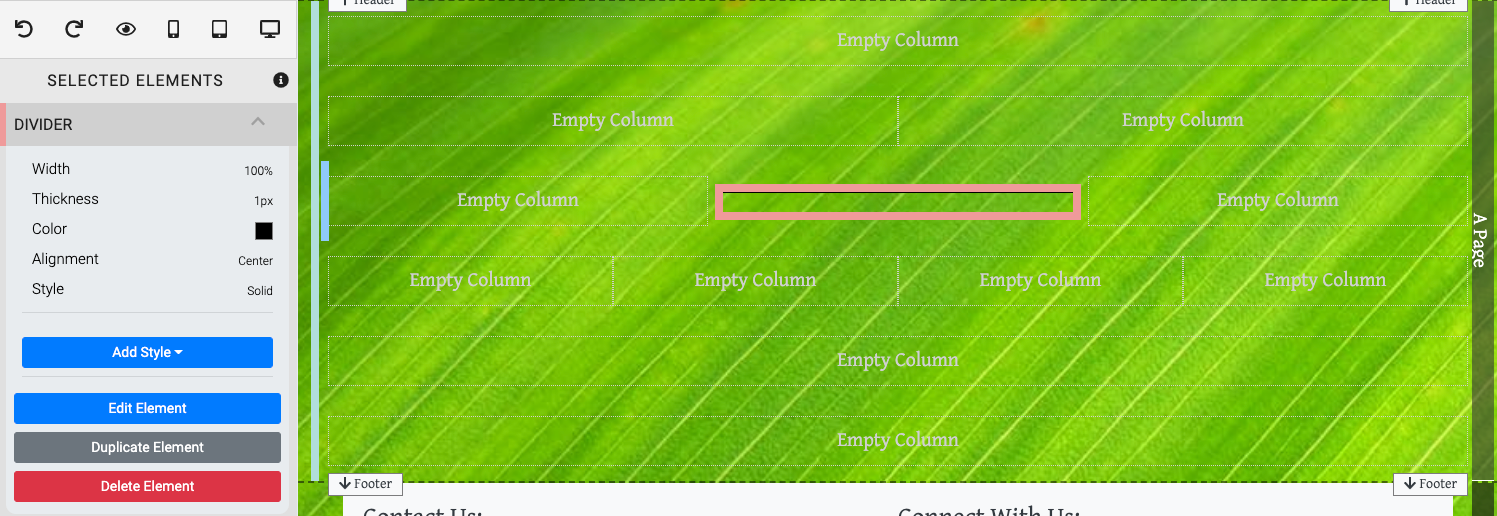
When the Divider element is highlighted it will be seen in the "Selected Elements" section of the Website Editor Sidebar. Clicking on "Divider" in the "Selected Elements" section will open up its settings.
Edit Divider
Width
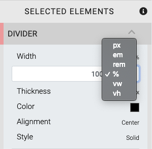
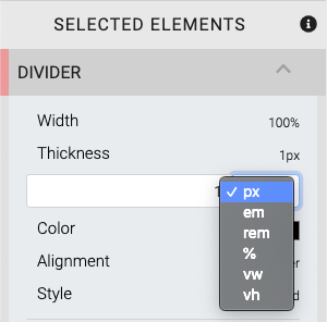
The Width, or length of the Divider can be set in one of several units of measure. The unit of measure can be selected from the drop-down selector at the right of the value field. The default is 100%.
Thickness
The Thickness, or height of the Divider can be set in one of several units of measure. The unit of measure can be selected from the drop-down selector at the right of the value field. The default is 1px.
Color
The color can be selected using a Color Picker. The default is #000000 (black).
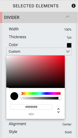
See Color Picker for more details on changing the color of the Divider.
Alignment
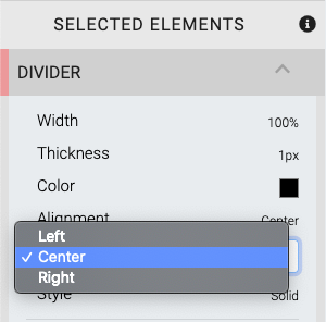
The Alignment option is only applied when the Width option is set to a value that is less than the full-width of the column space the Divider has been dropped into. The default is Center.
Style
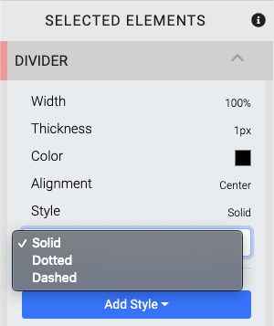
There are three Style options available for the Divider. The default is Solid.
INFORMATION
The Divider Style option is not the same as the Add Style general element option.
Recommended Reading
See Common Element Actions for more details on managing the Divider element.
Last reviewed: October 2024