Images and Links
An overview of the Item Details Images and Links tab.
The Images/Links tab allows you to save and manage the specific images associated with the item.
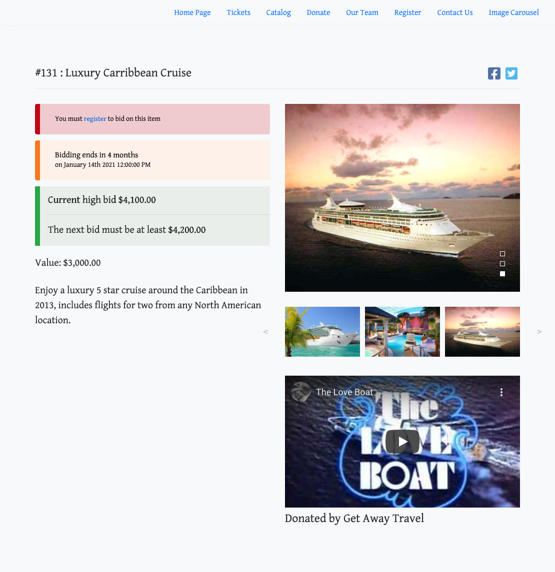
This is where you would set the default item image used as the primary display reference. Additional images can be uploaded to generate an image carousel on the Item Details website page.
You can also add Links for the item, in case you want to link to an external page where more information about it can be found.
Default Image
By default, when you create a new item, no images are included.
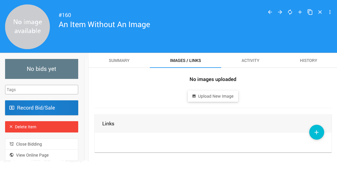
When an image is added, it will automatically be used as the item Default Image.
INFORMATION
The platform will used, in order: the item default image; the Event Details; and, then, the Logos for the item image. The "No image available" placeholder will be the default if no images are available from those locations.
Once you start uploading images, the default will be set automatically.
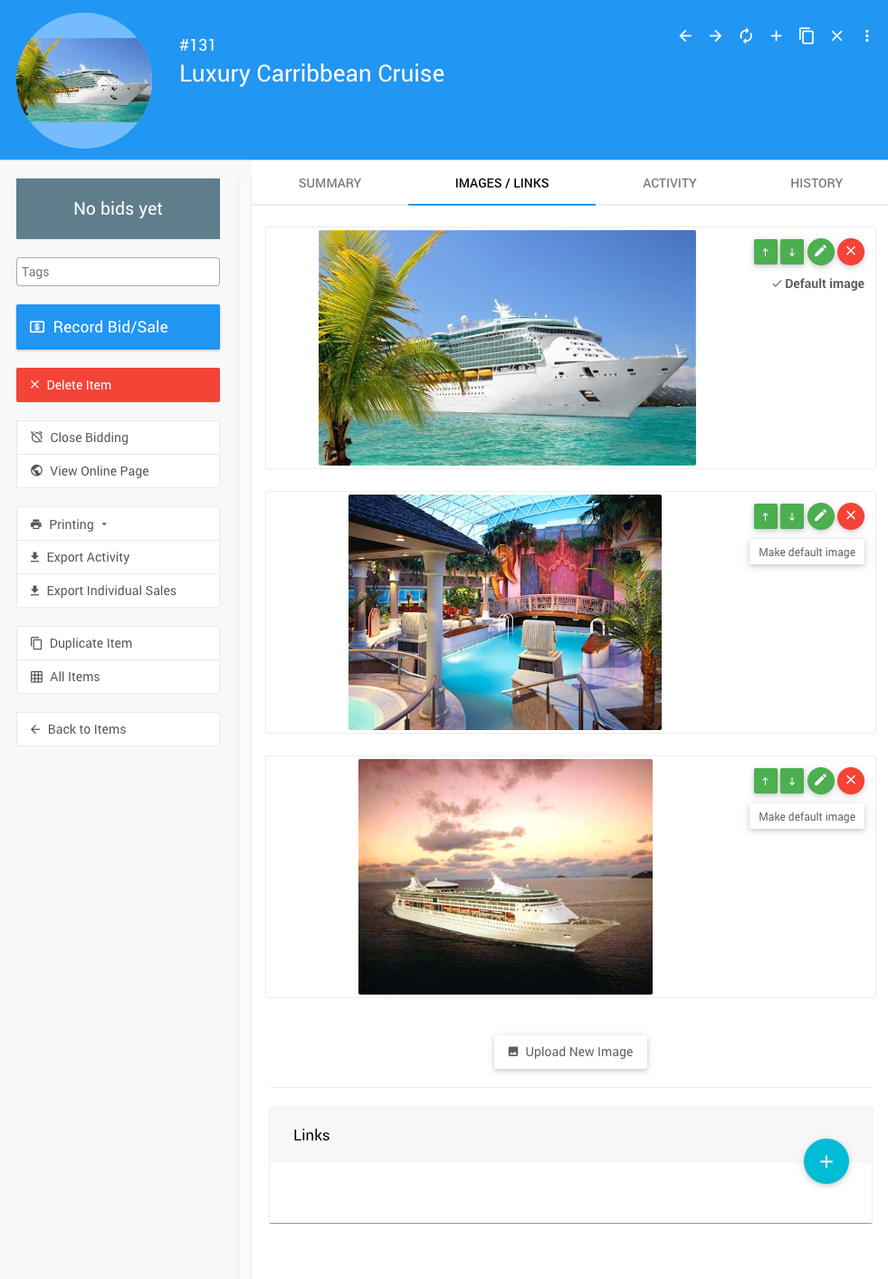
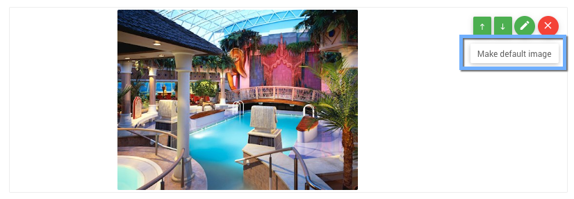
To change the Default Image, click the Make default image button to the right of the image.
Upload New Image
To add images to an item, click the Upload New Image button to open the Choose files window.
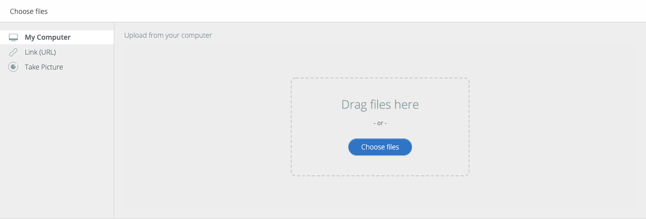
You can select from My Computer, a Link (URL), or (when using a mobile device) Take Picture.
IMAGE SIZES
The precise dimension is not critical (since screen sizes will vary), although a width roughly in the following ranges will work well in most cases:
- for "full-width" photos or images, a width of around 1200px is best;
- for "half-width" photos or images, a width around 600px should be used; and,
- page background images work well up to 1600px wide.
Image Controls
Just above the Make default image button are the Image Controls, allowing you to manage the specific image's position, edit the image, and remove the image.

Image Position
The Image Position controls (up and down arrow buttons) are available when there are multiple images. They are used to set the image order for the image carousel, starting with the Default Image and followed by the images in order.
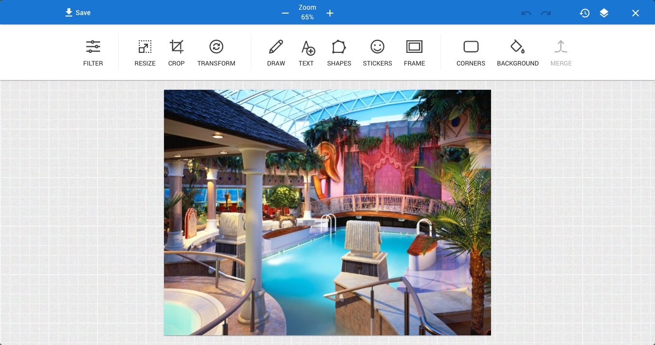
Edit Image
To open the Image Editor window, click the pencil icon.
Remove Image
Clicking the red X button will trigger a Confirm image deletion window before the image is deleted.

Click Continue to delete the image. This cannot be undone.
Links
At the bottom of the Images/Links tab is the Links section, where you can add external URL references.

Add A New Link
To Add A New Link, you click on the "plus" (+) icon to open the Add Link popup window.

Just fill in your URL Title (this lets you provide a reader-friendly reference) and the URL for the actual link to the external reference. Then click the Add Link button.
Clicking on the link will trigger your browser to follow it, just like a visitor to the site.
Removing A Link
To Remove A Link, you would click on the red "x" at the far left of the URL reference. This will pop up a confirmation window.

Video Link
If you Add A New Link to a YouTube or Vimeo video, the link will be embedded.
Last reviewed: November 2024